Some studios have vanity plates that are recognized everywhere. The moment you see a ring of stars swirling into place above a serene-looking mountain, for example, you know you're watching a Paramount movie. That little kid who tosses a fishing line into the water while sitting in the crook of the moon is instantly recognizable as DreamWorks. Such logos, once they climb to a certain point of universal recognition on the movie screens, are a sure fire form of brand name recognition.
It's become a common enough occurrence for a creator to have fun with their vanity plate; it will be changed in some way, just enough to put a new spin on it and usually being tied into the style and tone of the movie it's featured in. Match Cuts are also a common form of this; less common are logos appearing within a show's universe either as Easter eggs or Shout-Outs. If the logo appears within the work as well as the opening sequences, see Company Cameo. Thematic Sequel Logo Change and its subtrope Sequel Logo in Ruins are similar but deal with individual works as opposed to publishers and studios.
More examples are located at Logopedia![]() and the Audiovisual Identity Database (AVID).
and the Audiovisual Identity Database (AVID).![]()
Examples:
- The BBC
- Columbia Pictures
- Disney
- Metro-Goldwyn-Mayer
- Paramount
- Universal
- Warner Bros.
- Cartoon Network Studios
- DC Comics
- New Line Cinema
- Multiple Company Logos
- Video Games
- Electronic Arts
- Rockstar Games
- Other Logos
- The font on each logo varies with each appearance of the logo.
- Australia: The logo features a watermill wheel which the emu knocks to move it around a little, revealing the words "Darlinghurst-Sydney-Australia" on it. It can be seen here.

- Elvis: The logo is shaded gold and orange and is flanked by four badges reading "Truth", "Beauty", "Freedom" and "Love", from Luhrmann's previous film.
- The first trailer has the logo in gold against a black background, seen here.
- The first trailer has the logo in gold against a black background, seen here.
- The Get Down: The logo is done in the style of a graffiti drawing, seen here.
- The Great Gatsby: The logo has a revolving earth, seen here.
- When the studio expanded into non-horror features, the logo was toned down to simply a lightbulb going on.
- Black Christmas (2019): The trailer had the logo lined with Christmas lights.
- Freaky: The ghost girl is holding the LaDola Dagger.
- The Gallows: The logo is tinted red.
- Insidious: Chapter 2 has the logo be smaller than usual.
- The Black Phone debuted a new logo that features a pan through the house and its rooms, containing all sorts of horror movie homages, seen here.
- The Crimson Rivers: A literal crimson river cuts through the map of the 90's Gaumont logo and the space background at the end has a red tint as the logo fades into the opening credits, seen here.
- The little boy picking the flower in the 2000's logo gets roundhouse-kicked in JCVD, the Jean Claude Van Damme self-parody film. Seen here.
- The 21st century OSS 117 films Cairo: Nest of Spies, Lost in Rio and From Africa with Love use period-appropriate Gaumont logos (respectively, The '50s, The '60s and The '80s). Seen here, here and here.
- Blade Runner 2049 has its own version, which shows off the expanded frame size. The text has a digital look throughout and the camera travels down the city.
- Furious 7 variant here. It begins with the sound of somebody starting an engine, then the sound of a racing car skidding down the track plays over the rest of the countdown, which is blinking with neon lights.
- L.O.R.D: Legend of Ravaging Dynasties: As China's first motion-capture film, the statements are in Chinese and the logo features the powers/heroes of the film, as seen here.
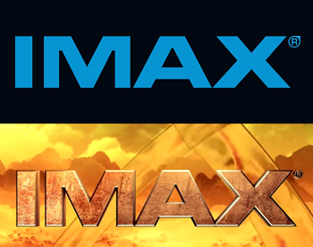
- Mission: Impossible – Rogue Nation variant here, where a lit fuse burns its way down to the IMAX logo and explodes. The countdown is scored with the franchise's theme song.
- The Chinese kung fu comedy Monk Comes Down the Mountain features a Chinese IMAX intro involving a trip across and over a moonlit mountain range, seen here. Someone laughs during the flash of light at the end.
- MonsterVerse:
- Godzilla (2014): Viewers were treated to a special version of the pre-movie countdown, where the screen shook with the sound of footprints and ended with Godzilla's roar.
- Kong: Skull Island variant here has its own visuals - the lettering resembles cracked rocks, and the camera travels across a yellow-tinted sky as we hear Kong's earth-shattering roar.
- Godzilla (2014): Viewers were treated to a special version of the pre-movie countdown
- Suicide Squad (2016) received a custom countdown that travels through Arkham Asylum down the streets of Gotham and ends with the Joker's laugh over the IMAX logo.
- Sully is the first to feature a "filmed with IMAX cameras" version. It has a dark starfield background and shows off the expanded film frame size.
- Spider-Man: Homecoming got a variant shown here, where the scenery is themed in red and blue and web is being shot everywhere.
- For the 2013 IMAX 3-D release of The Wizard of Oz, the countdown sequence was in a sepia tone instead of the regular blue. Seen here.
- National Treasure, the thunder sounds from the lightning hitting the three faded into the thunder sounds of the storm in the first scene.
- G-Force: Hurely runs on the road, trips on the logo's border frame when it zooms in and flees offscreen when the lighting strikes. Seen here.
- The Sorcerer's Apprentice :the lightning bolts make the same sound that the Tesla coil lighting makes in the film.
- Gone in 60 Seconds (2000): after the logo frames the lightning tree road, it zooms through the frame and resumes running up the road. here.
- Déjà Vu (2006) has the normal strike, then it rewinds and strikes again. Seen Seen here.
- The Lone Ranger features railroad track instead of the road that usually leads to the tree. Seen here.
- Kangaroo Jack has kangaroos jumping across the road. Seen here.
- For Christmas Episodes, such as those on The Bob Newhart Show, Mimsie was shown encircled by a Christmas wreath in place of the usual gold ribbon. Although the original ribbon appears for a split-second, possibly due to an editing error.
- At the end of the "Put on a Happy Face" episode of The Mary Tyler Moore Show, Mary Tyler Moore herself appeared in place of Mimsie and mouthed the words "Th-th-th-that's all folks!"
- At the end of the 1991 Mary Tyler Moore Reunion Show, Mimsie does not meow, instead saying "Bye!" in Mary Tyler Moore's voice.
- Similarly, a blooper reel for the final season ends with an audio swap of Mary saying "Bye!" and the cat.
- On videos produced by MTM Home Video, the kitten holds a remote control. After meowing, the kitten hits "rewind". The picture winds backwards (and loses color), and the kitten meows again.
- The Duck Factory: Before the logo starts, a voiceover asks "Where's the cat?" or "Here's the cat!" The cat then quacks.
- Eisenhower and Lutz: Mimsie's "meow" is sung by a group.
- The Graham Kerr Show: As befits a Cooking Show, the kitten wore a chef's hat. Also, her head does not move as much.
- Similarly, on Hill Street Blues, the kitten wore a policeman's hat.
- Two unique variants each appeared in a different episode of The Bob Newhart Show.
- In the third season premiere "Big Brother Is Watching", the cat growls.
- In the fourth season episode "No Sale", Mimsie is replaced with a shot of an actual cat named Abogast.
- In the third season premiere "Big Brother Is Watching", the cat growls.
- Newhart: Bob Newhart's voice says "Meow".
- The first episode has her meow normally.
- In the season 5 episode "Dick The Kid", Bob's meow is in a duller tone than usual.
- In the last episode, Darryl and Darryl scream "QUIET!"
- On the short-lived series Texas Wheelers an extremely rare variant features a cute black & white kitty outside looking around.
- The New WKRP in Cincinnati: Instead of a meow, you hear Les Nessman saying "Ooooh!"
- For Remington Steele the cat wears a Sherlock Holmes deerstalker cap and has a meerschaum pipe in her mouth; when she meows, the pipe falls and lands in front of the word "Productions".
- St. Elsewhere: The kitten is dressed for surgery in mask and smock. In the final episode, the kitten appeared above the closing credits, hooked up to life support machinery, and flatlined at the end of the credits, with the normal, rather upbeat show theme playingnote . (This variant doesn't always appear when shown in syndication.)
- By a sad coincidence, the real-life Mimsie would die later that same year (1988).
- The Steve Allen Show: The kitten wears heavy black eyeglasses and declares "Schmock!" in the voice of Steve Allen.
- The White Shadow: A different kitten from the usual Mimsie bounces a basketball off the MTM logo. The meow isn't heard in this variant.
- Xuxa: The kitten uses the voice of Xuxa saying "Ciao!"
- The feature film A Little Sex has an animated cartoon version of Mimsie meowing, followed by a second kitten appearing; the two then rub heads affectionately and purr.
- Bay City Blues has a cartoon Mimsie catching a baseball.
- Lou Grant, Paris, the theatrical release Just Between Friends, and the pilot for Three for the Road all feature a silent, still image of Mimsie in lieu of the meowing. In Just Between Friends, Mimsie's head is facing away from the camera.
- Speaking of Three for the Road, that short-lived show's final episode had an unusual variation: after Mimsie meowed, the gold ribbon and the shot of Mimsie within turned upside down for no apparent reason. This was also used in the last episode of the 1970s series Friends And Lovers.
- Carlton Your Doorman, MTM's only animated production — a TV special/pilot for a spinoff from Rhoda (itself a spinoff from The Mary Tyler Moore Show) — ends with a very annoyed looking white cartoon cat (not a kitten) glaring at the camera ("C'mon, say 'meow'... damn cat," grumbles Carlton).
- Most startling of all, the TV movie/Poorly Disguised Pilot Vampire has "AN MTM ENTERPRISES INC. PRODUCTION" in blood-red against a black background - and no kitten at all!
- In the unsold 1987 pilot In The Lion's Den, the cat says "Belrooney" or something similar to it.
- Not really a MTM program, but Minneapolis PBS affiliate KTCA did their own version at the end of a documentary on The Mary Tyler Moore Show.
- "Becoming, Part 2": The zombie says "Ohhh, I need a hug." (This was the episode where Buffy killed Angel and left Sunnydale.)
- "Amends" puts the zombie in a Santa Claus hat.
- "Graduation Day, Part 2" puts the zombie in a graduation cap.
- At the end of "Storyteller", the zombie sings, "We are as gods!"
- "Once More With Feeling": the zombie sings "Grrr... argh."
- "Bargaining, Part 1": the signoff is actually included in the episode itself, with Tara putting on a zombie finger puppet and going "grrr... argh."
- "Chosen", the final episode of the series: the zombie looks at the camera, growls, then keeps walking.
- Parodied in an episode of Robot Chicken, with the zombie doing the normal "Grrr... argh." before going on a rampage and killing people. The scene then cuts to show that it's Joss Whedon messing around, as an executive walks in and says, "Come on, Joss. That's why you got kicked off Wonder Woman."
- Sid and Marty Krofft created a puppet version of the logo for a 1974 NBC special, seen here. The announcer complains it's not the actual peacock, and the puppet is pulled off.
- The peacock was parodied on the NBC show Laugh In where it sneezed its feathers off.
- In the first episode of Walt Disney's Wonderful World of Color, which debuted on NBC as Disney's first foray into color television, Ludwig von Drake sings "The Spectrum Song" playing a piano keyboard that shoots out rainbow rays. These rays form the tailfeathers of the NBC Peacock, who walks in front of von Drake. An annoyed Von Drake tells the peacock off.
Ludwig von Drake: Ooh, what a showoff! How do you like that guy? I'm gonna let you in on something: confidentially, he dyes his feathers.
- Bumpers
- Ads for some NBC shows will sometimes play with the logo at the end of the ad. At the end of commercials for Revolution, the logo has a glowing yellow outline, and at the end of the commercials for Hannibal, the logo is blood red.
- On the week of Earth Day, it is totally green.
- One bumper which aired at Thanksgiving showed the peacock get attacked and turned into a turkey dinner, seen here.
- When NBC Kids used to play on Saturday mornings, a child's hand would peel off the logo in the corner every so often as if it were a sticker and then later glue it back in place.
- In the months following the 9/11 attacks, the peacock logo had the image of an American flag waving inside it.
- During the months prior to the Olympic Games (start of the year for Summer, and the start of the preceding TV season for Winter), NBC will usually put the Olympic rings under its bug during its entertainment programming. Since a 2015 graphics refresh (when the network began to use a persistent bug in the top-corner of the screen during all sports broadcasts — a practice for NBC that itself originated from the Olympics), NBC also uses this bug during broadcasts of Olympic sports outside of the Games.
- A bumper for NBC Europe involved a painting of a real peacock turning into the logo, seen here.
- One bumper had the peacock yawn and walk off after a hard day, seen here.
- John Kricfalusi animated two bumpers in the 90s, seen here and here. One has the peacock notice a rubber nipple stuck to its rump, so it shoots the nipple off its behind to show its feathers. The other the peacock play the NBC theme on a xylophone (which resembles the mid-1950s NBC logo), exploding when it hits the last note.
- When The Beatles' black-and-white movie A Hard Day's Night premiered on NBC in 1967, the network's "In Living Color" peacock intro was replaced with a "lively black and white" animated penguin.
- On a rare marketing reel for "Nightmare: The Host and Rodney", an otherwise standard Horror Host show, a still image of the peacock appears, looking a lot more vulture-like and undead. The announcer then proclaims that the program is presented "in livid color", and then a wolf howl is heard.
- A rather funny variation appears on a NBC blooper reel from 1963, in which the announcer forgets which network he's working for.
Announcer: This is the CBS Television... oh, goddamnit. - Tributes in other media:
- The cartoon Cool McCool had an episode where the NBC peacock (in Saturday morning cartoon design) leaves the studio so he can join the Owl (the episode's Big Bad) in avian solidarity.
- The Futurama episode "Anthology of Interest II" has Leela undergo a Wizard of Oz fantasy. The fantasy starts out in sepia, then becomes color: at the point that happens a peacock is seen spreading its rainbow wings, to reference their "In Living Color" trademark.
- The Family Guy episode "Peter's Sister" parodied the opening to The Cosby Show, seen here. "Knowing what we know now", the peacock appears, doped up like Cosby's female co-stars.
- In the Marsupilami episode "Toucan Always Get What You Want", Maurice grabs the NBC Peacock, to which Eduardo says "I don't want no stinky bird today, my stomach is craving for the little spotty guy with the tail", seen here.
- An 1981 episode of Saturday Night Live had Sesame Street's Big Bird act as the logo. Unusually, this was not a Muppet example.
- For the failed TV show Formula RC, the logo had the bear wear shades, the stars shine like traffic lights (red/orange/green), and driving sounds are heard.
- Grossology has the logo get drenched in goop.
- Star Wars features the planet Nelvaan, populated by the Nelvaanians, canine humanoids who resemble those from Nelvana's first feature Rock and Rule. Nelvaan itself was created thanks to Nelvana having animated The Star Wars Holiday Special.
- Altered Carbon:
- Season 2's date announcement and teaser briefly has glowing green lines in the Netflix logo, before an artefact changes their colors back to normal. This can be seen here.
- Altered Carbon: Resleeved had the same variation as season 2 of the parent show, only purple, seen here.
- Season 2's date announcement and teaser briefly has glowing green lines in the Netflix logo, before an artefact changes their colors back to normal. This can be
- Glass Onion's trailers consist of gold lines on the left and right the logo, seen here.
- Both teasers for the Guillermo del Toro adaptation of Pinocchio have the Netflix logo be briefly made of wood, seen here.
- Rainbow has neon green lines in the logo that revert back to the original colors, seen here.
- The School for Good and Evil (2022): At the end of the second trailer, the lines around the Netflix “N” are gold colored.
- Slumberland:
- Stranger Things: The Season 4 premiere has red stormclouds, the Upside Down dimension's hallmark, in the background of the Netflix logo, as seen here.
- The main trailer of The Sandman (2022) has the logo surrounded by grey lines.
- The Umbrella Academy (2019): The Season 3 trailer has the logo turn black and white, while sparrows fly through it, as seen here.
- Wednesday's trailer changes the line color to purple, surrounding the logo afterwards.
- Wendell & Wild's trailer contains light purple and spectral green lines around the logo.
- The Witcher (2019): The logo briefly consists of blue-grey lines that change back to the usual colors, seen here.
- Death Note Series:
- Death Note has the circle in the first logo's square glow bright orange. When it does, everything else dissipates into air, for the first shot of the orange moon in the night sky.
- As the first logo finishes rolling for Death Note: The Last Name, split-second shots of a silhouetted female appear. Just moments later, the logo fades away, but the aforementioned circle turns black. The camera zooms in on that, revealing it to be the pupil of a God of Death's green eye, viewing the scared woman.
- L: change the WorLd's variant has the first logo's outlines replaced with pink neon. Each symbol then flickers out.
- Death Note: Light Up the New World shows the second logo as usual. But when it gets to the Nippon TV logo, the text is white and the background is black, with the text underneath suddenly changing into the Shinigami language.
- Death Note has the circle in the first logo's square glow bright orange. When it does, everything else dissipates into air, for the first shot of the orange moon in the night sky.
- The live-action adaptations of Gantz have the logo change into an eclipse for the first/second film, as seen here, and the second film additionally zooms in to the logo to reveal the opening scene, as seen here.
- Each film in the Kaiji Series has ghostly noises chanting "ZAWA" repeatedly.
- Kaiji: The Ultimate Gambler's chanting gets quieter until the middle of the first logo. At this point, the chanting comes back in full force, stopping when the sun's light fades from the Nippon Television Network Corporation logo.
- For Kaiji 2: The Ultimate Gambler have the chanting in the first logo repeating in decreasing volumes, stopping at the same time like the first film's logo.
- Kaiji: Final Game's chanting in the third logo is distorted in different pitches, and when the logo turns black and white, the normal chant can be heard.
- Burlesque: The logo is lit up with limelights.
- D.E.B.S.: The logo takes on the plaid print worn by the schoolgirls.
- Easy A: The logo is set in the sky. Unusually, this applies to the logo at the start and the end of the film.
- Friends with Benefits: The logo appears on Dylan‘s screen during a meeting with his staff.
- This Christmas: The logo is red and covered in Christmas lights.
- Ultraviolet (2006): The logo appears as a corner-box image on several of the comic books in the Animated Credits Opening. Its style changes with the artwork on the covers.
- The logo itself was the subject of a documentary, The S From Hell.
- La La Land: The logo gets a retro look. As the film is a throwback to the musical films of yore, the logo is a riff on what Summit's brand would look like in the 60's, as seen here.
- Man on a Ledge: The Summit Entertainment logo has a background of New York skyscrapers on it, seen here.
- Step Up: For Revolution (2002), the Summit Entertainment logo gets spray-painted, seen here.
- The Twilight saga has a collection of these in dark weather, as seen here.
- Dragon Ball:
- A firefighting special has the Toei logo as gold against a black background.
- The logo is parodied in DBZ as part of the In-Universe studio ZTV, and is seen at the front of a cheesy low-budget film about the Cell Games. The Funimation dub adds a "Waves and Rocks!" title to it, seen here.
- In the trailers for Dragon Ball Super: Broly, the Toei logo glows green, replicating Broly's green Saiyan aura.
- In the trailer for the sequel Dragon Ball Super: Super Hero, the Toei logo is shaded red, pointing at the Red Ribbon Army's involvement in the film.
- Rebuild of Evangelion: The third entry Evangelion: 3.0 You Can (Not) Redo, had the old Toei Logo from 1950-2001.
- The 1958 anime film Hakujyaden, which was Toei's first animated venture, had the logo in gold against a blue background with fireworks.
- Kamen Rider:
- The third part of the Kamen Rider Decade and Double Movie Wars begins on a split screen, representing how Double's chasing of the Dummy Dopant will involuntarily converge with Decade's final battle against Super Shocker. Of course, both screens show the Toei logo twice.
- In the Double and OOO Movie Wars, the Toei logo is shown in red, yellow, green and purple, mirroring the color schemes of both Riders' basic forms (green and purple for Double and red, yellow and green for OOO).
- Kamen Rider Saber + Kikai Sentai Zenkaiger Super Hero Senki: The Toei logo plays the sound effects from both the 1971 Kamen Rider series and Himitsu Sentai Gorenger before the ocean freezes into ice and pans left to Agastya Base, where the main villain of the movie is imprisoned and is about to escape.
- Mechanical Violator Hakaider: The Toei logo pans to the left to the prison in the opening scene.
- Sailor Moon:
- Sailor Moon Eternal: The feature was divided into two films. The first film's trailer had the Toei logo given a sparkly pink appearance, while the second film's trailer has the logo shaded moonlight silver.
- The teaser trailer for the sequel Sailor Moon Cosmos has the logo in crystal (with a star-filled sky seen through it) against a black background.
- Super Sentai:
- Samurai Sentai Shinkenger Vs Go Onger Ginmaku Bang: The background for the Toei logo changes into a vertical three-striped flag, with the left side being green, the right side being orange and the middle remaining unchanged. This is followed by the screen quickly rotating 360 degrees before zooming out to reveal that this is only a portion of a bigger flag, with a repeating green-black-orange striped pattern. A Kuroko then pushes the flag away to start the movie.
- Tensou Sentai Goseiger Vs Shinkenger Epic On Ginmaku: After the Toei logo is shown, Gosei Red jumps into the waves, turns around and fires a Dragon Bullet at the screen.
- Gokaiger Goseiger Super Sentai 199 Hero Great Battle: The Toei logo is unchanged, but the Super Sentai 35th Anniversary logo is directly integrated into the opening as Gosei Red is sent flying through it by the enemy, breaking it to reveal the Legend War.
- A second one occurs later in the movie when Yogoshimacritein mentions that the movie he was making in his dimension is a "Goei" production (complete with his own Vanity Plate) - which Agri smashes with his FIST.
- Tokusou Sentai Dekaranger: The 2004 movie has the Toei logo pan to the left, leading into the opening scene on the beach.
- One Piece:
- One Piece Film: Gold: The trailer has the Toei logo in gold.
- One Piece Film: Red: The trailer has the Toei logo in Uta's colors of red and white.
- A Funny Thing Happened on the Way to the Forum: The United Artists logo is written in a messy Roman font, making it look like "VNITED ARTISTS".
- Sleeper, Manhattan, Stardust Memories and Raging Bull featured a black-and-white Transamerica/UA logo. Three of those films were shot in black-and-white.
- Fiddler on the Roof originally began with a timpani piece playing over the United Artists logo.
- A Bridge Too Far originally began with a sepia-toned United Artists hexagon.
- Some prints of the infamous Heaven's Gate had the words "A Transamerica Company" fading underneath the hexagon.
- The James Bond film For Your Eyes Only originally began with a UA logo similar to the 1975 logo, but with the "Entertainment from Transamerica Corporation" byline from 1968 fading underneath. Given the year this film came out (1981), and the situation UA was going through at the time, this could be interpreted as UA saying "Farewell" to Transamerica, after 14 years.
- The indie film Undertow used the early 1980's version of the United Artists logo rather than the current United Artists logo as the film's director wanted the logo to tie in with the film's setting.
- Producer Joe Roth is a big fan of Preston Sturges films, and he founded two studios named after them: Caravan Pictures and Morgan Creek Entertainment Group. note
- [adult swim]'s Williams Street Productions is named after Williams St., a street in Atlanta, Georgia where the company is based. Their logo's basis is a blurry photo of Ghost Planet Industries, the fictional studio from Space Ghost Coast to Coast - the first series Williams Street produced.
- Allspark Pictures was established by Hasbro, named after the Allspark from Transformers.
- Steven Spielberg’s Amblin Entertainment has as its logo the iconic shot of Elliot and ET’s flying cycle against the moon from E.T. the Extra-Terrestrial.
- Edward Zwick's studio The Bedford Falls Company is an obvious homage to It's a Wonderful Life, all the way down to using George Bailey's house as the basis for the logo.
- Bryan Singer’s studio Bad Hat Harry Productions is named after Singer’s favourite film Jaws. The logo features an animated Martin Brody and Harry sitting on a beach, with a shark in the distance.
- A new logo was used in 2011 that featured the line-up scene from Singer’s film The Usual Suspects.
- Rob Reiner’s Castle Rock Entertainment is named after Stephen King’s fictional Maine town.
- Mamoru Hosoda’s Studio Chizu has as its mascot Makoto Konno, the protagonist of Hosoda’s film The Girl Who Leapt Through Time.
- Circumference Films is based on the circular motifs found in Economy Watch.
- Dark Castle Entertainment is named after director William Castle, and had started with remaking Castle’s films.
- The TV studio Desilu Studios is named after Desi Arnaz and Lucille Ball.
- Richard Donner and his wife Lauren founded The Donners' Company, and at one point it had a logo based on the title sequence from Donner's film Ladyhawke.
- Studio Ghibli has the title character from My Neighbor Totoro as its mascot.
- Adam Sandler’s Happy Madison Productions is named after Sandler’s films Happy Gilmore and Billy Madison. The logo features Sandler’s late father Stanley, as Adam hoped he would enjoy his films.
- Hirohiko Araki’s studio Lucky Land Communications has as its logo a badge with a hand on it. This badge as well as the Lucky Land phrase appears in various places in Araki’s manga JoJo's Bizarre Adventure.
- Mirage Studios, formed by TMNT co-creators Kevin Eastman and Peter Laird, has a stylized Ninja Turtle’s face as its logo.
- Flying Rhinoceros, formed by Flying Rhino Junior High creator Ray Nelson, features a rhinoceros flying a plane as its logo. It serves as the basis for the name of the show, and not to mention that Principal Mulligan is loosely based on the rhino in the logo. The logo also makes numerous appearances on the show itself, usually as part of the titular school.
- Savage Studios, Ltd. is named after its founder, Eek! The Cat creator Savage Steve Holland. Its logo used on later projects features a self-portrait of him.
- Tina Fey's company Little Stranger's logo is a picture of her daughter Alice Richmond in a peacock costume. It is converted into a drawing on later projects.
- A.K.A. Cartoon, founded by Ed, Edd n Eddy creator Danny Antonucci, features a caricature of him getting impaled by a giant pencil for its logo. On the show itself the logo changed colors every season.
- Jordan Peele set up Monkeypaw Productions, named after his favourite horror tale.
- Melissa Joan Hart and her mother Paula formed Hartbreak Films in 1993. Its logo is an outline of a heart with egg-like cracks in it.
- Nelvana is named after the Canadian comic-book heroine Nelvana of the Northern Lights. In fact she was originally intended to be the mascot, but a polar bear was chosen instead.
- Indian filmmaker Raj Kapoor launched a film studio, RK Films, which had as its mascot two lovers in a waltz pose, copied from a scene from one of his films Barsaat.
- Sergio Leone launched a studio, Rafran Cinematografica, named after his two daughters Raffaella and Francesca.
- Thunder Cats 2011 features a magic bag which can be opened with a magic word: “Rankinbass!”, A Shout-Out to the studio that made the 80s cartoon.
- Toei Animation uses as its mascot Pero, the hero of The Wonderful World of Puss 'n Boots.
- Tsuburaya Productions has as its logo the arrow insignia from Mighty Jack, which Eiji Tsubaraya considered one of his best works.
- In Zen Studios' The Avengers, Iron Man is on the right side of the playfield fiddling with various computer screens, one of which displays the Marvel Comics logo.
- Not exactly a joke, but in Creature from the Black Lagoon, the old Universal-International logo pops up when you start the game's multiball.
- The Munsters: The Attract Mode displays a version of the Stern Pinball logo that appears to be dripping with slime, somewhat like the original series' logo.
- The logo card at the bottom of Avengers: Infinity Quest's playfield replaces the pinball in Stern's logo with the Power Gem, surrounded by the other five Infinity Gems.
- Fox
- To promote the release of The Simpsons Movie, the logo was colored yellow, with the "O" replaced by a pink donut.
- Cartoon Network
- For April Fools' Day 2011, the logo was flipped upside-down.
- In October 2019, the logo was given bat wings for Halloween.
- In December 2019, the logo was decked with Christmas lights.
- Nickelodeon
- For the days leading up to the premiere of Teenage Mutant Ninja Turtles, the logo gained a green turtle shell design.
- To promote the release of the film Jimmy Neutron: Boy Genius, there were several animations of Jimmy Neutron experimenting with and altering the logo.
- To promote the launch of Paramount+, the logos for all Nick-branded networks were colored blue.
- Nicktoons
- The rotating 3D logo was colored slime green during the "Nicktoons Scare-a-Thon" in 2004.
- Similarly in 2007, the splat globe was changed into an eyeball for Halloween.
- FXX
- During the network's first 12-day marathon of The Simpsons, the FXX logo was colored yellow.
- USA Network:
- During the Harry Potter marathon for the 2019 Thanksgiving weekend, the USA logo was placed on the left side of the screen (instead of the right), was colored gold, and had a drawing of the Golden Snitch next to it.
- Boomerang: During Late Night Black and White, the Boomerang "B" logo was grayscaled.