Whether it's because of some significant change in the series (like being released on a new console, or in an Alternate Universe), or just the designers wanting something different, occasionally the art style of a series may change for a sequel. Then, in some cases, the new art style may become the default art style.
This trope is for when the previously used art style in a series is switched in a sequel. This can invoke They Changed It, Now It Sucks!, if the change of style is unwelcome by fans of the original work. Note, that if a series continues to use one style for too long, some fans might complain that It's the Same, Now It Sucks!.
A Sister Trope of Art Shift, which is a temporary change of visual style within a work and Art Evolution, which is a gradual change but generally still within the same style. Compare Shifted to CGI and Video Game 3D Leap, when a franchise's visuals change from 2D to 3D.
Video game sequels and remakes being made for games on older console generations would most likely get an remaster to take advantage of the new hardware, although there are exceptions.
Examples:
- Attack on Titan:
- The first season employed a Thick-Line Animation style that the second season onward dropped.
- After the anime switched animation studios from Wit Studio to MAPPA. Because of the shift, the character designs for the last season looked different from the first three seasons, making it closely similar to the mangaka's art style.
- Staring in Season 2 onward, BanG Dream! shifted from 2D hand drawn animation, to an All-CGI Cartoon.
- The first season of Beyblade was animated by Madhouse, while the next two and the movie were done by Nihon Animedia in a style closer to the manga. The franchise would retain this style into Metal Fight Beyblade, where animation was handed off to Tatsunoko and Synergy SP, along with the Nelvana-commissioned BeyWarriors series.
- Season 4 of the Haikyuu!! anime adaptation marks the debut of the new art style. While Seasons 1-3 of the anime generally retains the original character designs, they also have some stylistic differences from the manga (notably the eyes are a bit different and muscles are toned down); the Season 4 designs still resembles the previous anime style while also following the manga art more closely.
- High School D×D: The first three seasons were animated by TNK. Due to the creative diferences during Season 3, for the fourth season, Hero, production was taken over by Passione, and with it the art style changed from a sharp, shonen-like art style to an overall softer-looking style that is much more in line with the light novel's original illustrations.
- Iron Man: Rise of Technovore was followed up by Avengers Confidential: Black Widow & Punisher, yet many of the male characters have more lines on their faces. One of the special features even points out the Punisher, with the crew wanting a more comic-accurate version for the latter film, hence the burly design with mostly slicked-back hair compared to the thinner design with messy hair in Technovore.
- While art style changes in the original JoJo's Bizarre Adventure manga were a result of slow and gradual changes over time, the David Productions anime adaptation, which began decades into the manga's run, goes a different route. The art style in each Part is unchangingnote and the next Part begins looking dramatically different from its predecessor instead of gradually shifting into a new style.
- Liz and the Blue Bird, a spin-off of Sound! Euphonium, has a very different style from the main series. Characters are given smaller eyes and more realistic body proportions in comparison to the more stylized appearance typical to other Kyoto Animation productions. The colors and shading are also significantly subdued, suiting the film's quiet and introspective tone—and making it more noticeable when the film itself art shifts into storybook sequences with vibrant watercolor artwork.
- Lupin III: With five/six series to date note , and dozens of TV specials, it is inevitable that this work would become an example of this trope.
- Lupin III: Part 1 has thick lines, and a dark colour palette with high saturation.
- Lupin III: Part II used thinner lines, and rounder shapes. The colour palette was much lighter this time, with lower saturation, and character designs closer to the then-current manga series.
- Lupin III: Part III was somewhere between the two in terms of saturation, using a mix of bright and medium colours. The shapes were often very curvy, especially in the first few episodes. The characters look even closer to the manga, before starting to get looser and cruder as the show goes on. Except for one movie, the animation style used here is never repeated.
- For most of the 90s, the Lupin III Yearly Specials would have different character designs depending on who directed. At the Turn of the Millennium, the style settled down into something closer to the "Red Jacket" series, with updated colour palettes and techniques, every year.
- The release of Lupin III: The Woman Called Fujiko Mine brought the franchise to a new style, one inspired by not only the original manga series, but gothic art, with darker colors, multiple Art Shifts, and a tendency for more lines, as well. The art style returned in the "Takeshi Koike Trilogy"-Gravestone of Daisuke Jigen, Goemon Ishikawa's Spray of Blood and Fujiko Mine's Lie but without the gothic influence, and a "smoother" look overall.
- Lupin III: The Italian Adventure has character designs inspired by the "Green Jacket" series, but with a brighter palette, thinner lines, and a more modern aesthetic overall. This style was retained for Lupin III: Part 5, but with even more detail given to the character designs and more fluid animation.
- Lyrical Nanoha:
- The art style in the anime adaptation of ViVid is somewhat different from the rest of the series, with brighter colors and a lack of shaded contours. This is due to it being the only part of the franchise not animated by Seven Arcs.
- The character designs in Reflection and Detonation are subtly different from the previous movies. The actual character models haven't changed all that much (beyond what can be justified by the characters being two years older) but the color palette is softer and the shading style is noticeably different (essentially the opposite of ViVid's changes, above.) When there's a flashback to the events of an earlier movie, the difference is noticeable.
- Megazone 23 Part II replaced the previous film's character designer Toshiki Hirano with Yasuomi Umetsu, who redesigned all the returning characters with more realistic appearances.
- The first season of the anime adaptation of My Teen Romantic Comedy SNAFU was originally animated by the studio Brain's Base, whose animations were, while not bad, were mediocre at best. Come second season, the reins of adapting the rest of the light novel were given to Studio Feel, whose designs for the characters were closer to the original light novel's artwork. There was a huge improvement in the animations, too.
- Pokémon: The Series has had the occasional art shift between sequels. Pokémon the Series: Black & White gave Ash noticeably larger irises than previous installments, changing his eyes from seemingly black to visibly brown. Pokémon the Series: Sun & Moon features a much larger art shift than before, with another noticeable difference in Pokémon Journeys: The Series.
- Pretty Cure:
- HappinessCharge Pretty Cure! has a chunky style with poofy hairstyles, black pupils in the eyes, and simplistic Cure designs. By comparison, its successor season Go! Princess Pretty Cure has a more 90s-esque style, with longer, leaner bodies, white bubbles in the eyes, and very elaborate Cure outfits.
- Tropical-Rouge! Pretty Cure is fairly cartoony with white bubble eyes, bright colours, and sharp outfit design. Delicious Party♡Pretty Cure instead opts for more realistic eyes, softer colours, and more frilly outfits.
- Season 1 of The Quintessential Quintuplets was animated by Tezuka Productions. For Season 2, Bibury took over production, using an art-style that's much closer to the original manga (notable especially on the colors used for Fuutarou's eyes and hair, both of which have a blue shade during Season 1, but for Season 2 he's given black hair and amber eyes).
- Sailor Moon Crystal sees a shift from its 1992 predecessor not only due to improvements in technology allowing better animation than 1992, but as a result of deliberate effort to more closely resemble the manga. All the characters look taller and thinner than their 1990s anime versions. The third season shifts to a Pretty Cure-like art style (the lead character designer of that season, Akira Takahashi, worked on several seasons of the Pretty Cure series), while the Sailor Moon Eternal film brought back Kazuko Tadano (the character designer of the 1992 anime) for a modern interpretation of the '90s designs.
- While the Shakugan no Shana anime's art style itself didn't changed drastically, it's the characters' eyes, head and body proportions that changed over time. Just compare the titular character Shana's design in the first season to the third season.
- The Tamagotchi franchise has several anime installments (three tie-in OVAs for McDonald's, a 12-episode webtoon, two movies, and a 271-episode TV series) which all use an art style that, while still simplistic like the franchise in general, gives more detail to the characters and abandons the franchise's tendency to show the characters with blue outlines. This art style remained uninterrupted until an anime short film of the series was released in 2017 to be shown before screenings of the Kamisama Minarai: Himitsu no Cocotama movie; this short film shifts the art style by combining the anime's art style with the blue outline style of the franchise in general, which basically causes everyone to look shinier.
- In the Tokyo Ghoul anime, throughout the seasons, it's not completely noticeable, but the art has indeed shifted. Especially with the main characters design.
- Pleasant Goat and Big Big Wolf:
- Mr.Wolffy, Mr.Right! has a paper art style with exaggerated expressions.
- The season War of Invention has a clean, simple, and cartoony art style that reminds many of the later seasons of Happy Heroes. This art style is only used for that one season. Mighty Little Defenders is the sequel to War of Invention and it goes back to the original style.
- Its spin-off Pleasant Goat Fun Class goes for a simple and cute art style aimed at preschoolers.
- When guest creators are invited to make Homages for comic book series, be it as shorter stories for compilations (e.g. Asterix, Werner) or full issues (e.g. Lucky Luke, Spirou & Fantasio), they're allowed to draw in their own styles as long as the characters stay recognizable. This way, it's also recognizable who drew the story in the first place.
- The single 2018 episode of The Rabbit with the Checkered Ears was animated digitally, with vibrant colors and wobbly outlines, as opposed to the original 70s series' minimalistic traditional animation and washed-out pastel colors.
- The first three BIONICLE movies by Creative Capers gave drastic redesigns to the characters to make them more alive and expressive. The distant sequel The Legend Reborn by Tinseltown Toons mostly stayed close to how the LEGO figures looked, but with rugged texturing. The Matoran characters seen briefly at the start have Creative Capers-style glowing round eyes, while the new characters have rectangular pupils.
- The art style of Go West! A Lucky Luke Adventure by Xilam was a radical departure from that seen in the much older Lucky Luke: Ballad of the Daltons (which itself evolved from Lucky Luke: Daisy Town), which stuck closer to the art style of the comics.
- Puss in Boots (2011) has a realistic CGI animation akin to the previous installments of the Shrek franchise. Its sequel, Puss in Boots: The Last Wish, has a more stylized artstyle that combines CGI with hand-drawn details, more exaggerated expressions and designs, a deliberate drop in frames per second during action scenes to highlight the impact of the movements, and especially a painterly visual in which textures use paint-brush strokes, thus making the film resemble the paintings of a fairy tale storybook.
- Superman/Batman: Public Enemies tried to emulate the art syle of Ed McGuinness, who drew the comic version of PE. Its sequel, Superman/Batman: Apocalypse, has an art style trying to emulate the late Michael Turner, who drew "The Supergirl from Krypton".
- DC Extended Universe:
- Zack Snyder used way more vibrant colors in Batman v Superman: Dawn of Justice compared to Man of Steel, and slow-motion whereas there was none in the first film.
- For Zack Snyder's Justice League, he used an ashy Color Wash, making golden and silvery tones pop out, and released the film in 4:3 Aspect Ratio instead of 16:9. There's also a Deliberately Monochrome version.
- The Matrix Resurrections has a different aesthetic from the original trilogy, due to both director Lana Wachowski deciding to prioritize natural lighting when the others relied on artificial one, and the fight coreography changing from hyper-stylized to gritty and realistic.
- No Transformers series has so far managed to keep an consistent art style between sequels.
- The original The Transformers was made in a time before computer graphics with very colorful and blocky character designs, but its sequel, Beast Wars, was all CG with a muted color palette. A trend which carried over to its own sequel Beast Machines, which also had much sleeker character designs than its predecessors.
- The Unicron Trilogy had a similar thing going on with Transformers: Armada being entirely in 2D, while Transformers: Energon made use of cel-shaded CG for the Transformers themselves (occasionally switching to 2D or ditching the cel-shading for a few memorable scenes) and 2D for everything else. Transformers: Cybertron did the same but ditched the cel-shading entirely.
- Transformers Aligned Universe.
- First was the Transformers: War for Cybertron and Transformers: Fall of Cybertron games. Which made us of the after mentioned G1 aesthetic, but in a CG environment and with much more detailed/bulky designs. Something which was thrown out the window entirely once Transformers: Prime came along in favor of much sleeker models inspired equally by the live-action movies and Transformers: Animated.
- This was again ditched for Transformers: Robots in Disguise (2015), which applied cel-shading to the CG, greatly lowered the frame rate of the animation and got rid of Prime's Real Is Brown art style. The backgrounds were also now hand drawn and the character designs again got more G1 inspired.
- Transformers: Rescue Bots art style on the other hand is very simple and like Energon, the show will sometimes shift between CG and hand-drawn.
- Transformers: Rise of the Dark Spark brought back the War for Cybertron aesthetic but the character designs were now much more inspired by the ones from the movies.
- Bayonetta Origins: Cereza and the Lost Demon is a storybook-styled prequel, with a painterly art style to contrast with the more realistic main games.
- The original BioShock and its first sequel are set during the 60s in the Diesel Punk influenced underwater city of Rapture. Their aesthetic is grimy, worn and dominated by foggy green and brown hues. BioShock Infinite changes setting to Columbia, a Steampunk city in the clouds set during the 1910s, inspired by 1890s American neoclassical aesthetics. When compared to the originals, this setting is notably more pristine and has a vastly different colour palette of blues, oranges and pinks. This contrast is most obvious during the brief return to Rapture near the end of the game.
- BIT.TRIP. Compared to the Atariesque Retraux of the first six games, the Runner spinoff series starting from Runner2 makes quite the cartoony Video Game 3D Leap.
- Out of all Blizzard Entertainment's strategy games, only the first
 ◊ two◊ Warcraft games look like each other, with Warcraft III having made the jump to 3D◊. Interestingly, StarCraft originally looked◊ a lot more like Warcraft II. This changed after the dev team saw a much better made game using Isometric Projection, giving it this look◊ (and twelve years later, Starcraft II◊).
- Castlevania has shifted styles a number of times:
- The early games don't really have a well-defined style due to the limitations of the NES's graphics, but things got more varied in the 16-bit era. Super Castlevania IV for the Super Nintendo established a very dark, grungy, and realistic look in both gameplay and its brief cutscenes. The following game, Castlevania: Rondo of Blood, tossed this aside in favor of a bold, bright, anime-inspired look, which is especially prominent in the cutscenes. Castlevania: Bloodlines retained the bright colors but dropped the anime style.
- Symphony of the Night took the series in a completely new direction visually thanks to art and character design by Ayami Kojima, who brought an elegant, moody, and gothic aesthetic with lots of intricate detail and distinctly Bishōnen male characters. Kojima would return to provide the art and designs for most of the subsequent titles, but with intermittent exceptions that cause the series's overall style to seemingly turn on a dime.
- Circle of the Moon, the first installment for the Game Boy Advance, went back to the anime look, this time with character designs by Kazuko Fujihara. The series' other two GBA titles, Harmony of Dissonance and Castlevania: Aria of Sorrow both have Kojima on art duties and closely resemble Symphony.
- Aria's sequel for the Nintendo DS, Castlevania: Dawn of Sorrow, went for the anime look yet again, resulting in a huge visual shift between the two. The next DS game, Portrait of Ruin, retained this, but the third, Order of Ecclesia, returned to Kojima's style despite the art actually being by Masaki Hirooka.
- Castlevania: Judgment looks utterly unlike any other game in the series, with wild and bizarre character designs by Takeshi Obata of Death Note fame.
- Dance Central:
- The sequel Spotlight has a subtler but notable shift that made character models look more rubbery.
- With Dance Central VR, Harmonix brought the art style back to the 2D of the original Dance Central opening.
- The Dragon Age series had a major art overhaul between Dragon Age: Origins — which was pretty standard fare Medieval Fantasy style — to Dragon Age II — whose visuals are highly stylized, particularly in regards to the depiction of elves and the Qunari. The series backpedaled on the stylization a bit with Dragon Age: Inquisition, which tries to find the middle ground between the first two games' styles — this overhaul was also partly a consequence of moving to a different Game Engine.
- The first F.E.A.R. game takes place 20 Minutes into the Future, but has an overall modern day design in regards to characters, equipment, and environments with the exception of the rare plasma sniper rifle or Mini-Mecha. The sequel, F.E.A.R. 2, has a much more cyberpunk anime aesthetic, with enemies wearing futuristic armor with glowing bits all over it and the Mini-Mecha and other vehicles being more futuristic/fantastical in appearance. The third and final game, F.E.A.R. 3, is mostly consistent with F.E.A.R. 2's art style, but the overall aesthetic is massively more grungy and sleazy, as though it was the second game filtered through a few thousand hours of Rob Zombie and Slipknot.
- For a while, the Final Fantasy franchise stuck with the chibi sprites in an anime style. By Final Fantasy VI, the chibi sprites were still used, but they were drawn in a grittier and grungier look. Final Fantasy VII was the first title to make the leap to 3D and it shifted the art style more towards anime styled. Final Fantasy VIII toned down the anime style while giving characters on the field map better proportions. Final Fantasy IX changed the art style again where characters had all kinds of proportions from normal to exaggerated and the style was a mix of anime and western cartoons. Final Fantasy X and later games in the franchise went back to the realistic/anime style.
- Once Fire Emblem went portable with Fire Emblem: The Binding Blade, the art style was significantly changed from the console-based predecessors. Character illustrations began to be done digitally and the designs slowly drifts away from the 90s fantasy flair of the Jugdral games. The in-game color palette is far brighter compared to the previous titles on the Super Famicom, a necessity due to the original model of the Game Boy Advance not being backlit.
- The first three Halo games, which form the "classic trilogy", have a consistent art style. The fourth mainline game, Halo: Reach, uses a somewhat different art style, with the human characters having much bulkier and "busy-looking" armor while the Covenant characters were more alien and feral-looking also with spikier and more complex armor. Halo 4 and Halo 5, made by a different development studio, also took the series' art style and character design in a completely new direction, which was heavily criticized by long time fans. Halo Infinite would return to the more classic art style of the original trilogy games as part of its Revisiting the Roots approach.
- Jumper Three features stylized retraux graphics in contrast to MS Paintish graphics of previous installments or 16-bit style of Jumper Redux.
- Kirby:
- This trope occurred between Kirby Super Star and Kirby's Dream Land 3, where the art style changes from one that resembles more or less an updated version of the older games' art style for the former to a crayon-like look for the latter.
- Then came Kirby 64: The Crystal Shards, where the game's now in full 3Dnote . Then came the remake of Kirby's Adventure, where the art style is, yet again, changed, not only giving Kirby his modern design outside of both his 3D portrayals and his portrayal in the anime, but also giving the game a modernized art style that involves, amongst other things, smoother animations and bigger minibosses.
- This then was averted with Kirby & the Amazing Mirror, which used the same art style as with the Kirby's Adventure remake.
- Then came Kirby: Canvas Curse, which went with a paint-like art style due to the fact that a paint sorcerer being is trying to turn Dream Land into a world of paint. The next game in the series, Kirby: Squeak Squad, then reverted back to the art style of the Game Boy Advance games.
- After that, the remake of Kirby Super Star (Kirby Super Star Ultra) came, which changed to an art style that can be described as a combination of both the art style of the GBA games and that of the original Super Star.
- Then note came Kirby's Return to Dream Land, which had a different 3D art style than that of Kirby 64: The Crystal Shards note .
- Averted in Kirby's Dream Collection's challenge stages and the subsequent traditional platformers which use the same 3D style and models as Kirby's Return to Dream Land.
- Kirby and the Rainbow Curse, being a sequel to Canvas Curse, also features a art shift that's different from standard Kirby games. Unlike the paint-like art style of Canvas Curse, however, Rainbow Curse features graphics that emulate claymation.
- Kirby Star Allies uses the same 3D models as the other modern games albeit photo-realistic.
- The Legend of Spyro: A New Beginning and The Eternal Night use a fairly simple, cartoony look similar to that of the classic games. Dawn of the Dragon uses a much more detailed, realistic one, with notably less stylized proportions and more complex rendering and shading.
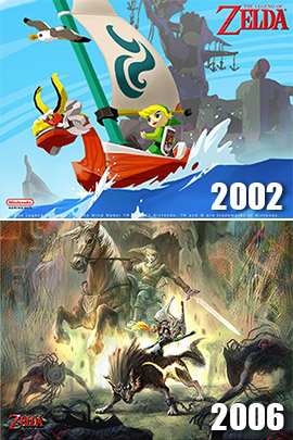
- The Legend of Zelda series frequently changes its art styles in-between sequels. Usually switching from realistic anime style to a chibi anime style and back again depending on what sort of mood and the age Link is in the game.
- From Ocarina of Time and Majora's Mask and their realistically proportioned (for a N64-era game), angular anime-style graphics, to the Cel Shaded design of The Wind Waker.
- Twilight Princess used a grungier version of the Ocarina of Time style.
- Skyward Sword has a semi-Impressionistic look that's basically a cross between the Wind Waker and Twilight Princess art styles, featuring the cel-shading and bright colors of the former with the realistic proportions of the latter.
- A Link Between Worlds has an art style that resembles A Link to the Past updated to 3D, while in Tri Force Heroes, Link himself looks more like the Wind Waker incarnation.
- Breath of the Wild has cel-shading and bright colors mixed with realistically-proportioned characters much like Skyward Sword but with a more gouache-inspired and weathered-looking aesthetic.
- Super Mario Bros.:
- Super Mario World 2: Yoshi's Island uses a crayon-inspired art style for the levels, characters, mooks and effects, diverting from the standard sprite-based colors and designs of Super Mario World. Also an Invoked Trope, because Nintendo originally planned the game to use an art style inspired by that of Donkey Kong Country until Miyamoto opposed the idea and presented the aforementioned style instead, which the company actually liked.
- Super Mario Bros. Wonder uses a slightly looser and more whimsical art style than its predecessors (particularly the New Super Mario Bros. series), resembling the style used for the franchise's 2D artwork translated directly to 3D. Most notable is its use of "texture mouths" for certain expressions.
- Mario & Luigi: The switch between Mario & Luigi: Superstar Saga and Mario & Luigi: Partners in Time saw a minor increase in sprite size to take advantage of the NDS's bigger screens. Other than that, it's mostly the same art style. While Mario & Luigi: Bowser's Inside Story averts this by having the same art style compared to Partners in Time, Mario & Luigi: Dream Team does not, being the sub series' Video Game 3D Leap with 2½D elements. note
- Mario Kart 8 is one in itself, but also provides an interesting case of an art shift happening within the same installment. The original game tracks (and the ones from its Downloadable Content) all use a heavily detailed, pseudo-realistic art style, unlike the brightly colored, cartoonish settings of Mario Kart games past. The Updated Re-release Mario Kart 8 Deluxe kept this aesthetic for the newly added Battle Courses. In that game's DLC, though, many of the new courses are lifted from Mario Kart Tour and use a slightly updated version of its simplified, stylized, low-detail art style, including for tracks that didn't have Tour counterparts at the time. Even brand-new courses like Sky-High Sundae use this art style. While it works better on some tracks than others, playing a course from the base game, then one from the DLC back-to-back can be pretty jarring.
- WarioWare Gold: In stark contrast to the previous WarioWare games, which more or less shared a similar artstyle to each other, Gold has a considerably more cartoonish artstyle that closely resembles a show on Cartoon Network or Nickelodeon. This would become the standard artstyle for the series going forward.
- Mega Man: The Mega Man Zero and Mega Man ZX series feature a radically different art style from the rest of the Mega Man franchise. You'd be forgiven for thinking thick armor and pupils fell out of fashion in favour of latex and chunky bracelets between the X series and the Legends series, if Mega Man Zero 3 didn't imply the art shift were retroactive via Zero's old body (used by the Big Bad) being his current one in a different colour, and not his Mega Man X appearance. note
- Metal Gear Ac!d had a graphical style closely in keeping with that of its parent franchise, whereas Metal Gear Ac!d 2 had stylized, cel-shaded graphics.
- Mighty Gunvolt: While the first installment used cartoony SD visuals, Burst shifts into a Puni Plush art style.
- Nidhogg has the look of a Atari-era game with blocky pixels and a fairly limited color palette, with the player characters having no defining details beyond their colors. Its sequel, by contrast, is extremely colorful with grotesque-looking details added to everything.
- The original Octodad goes for a semi-realistic artstyle (or as much as a student project is able). Dadliest Catch retains similar proportions for the characters but is a lot more cartoony in its textures to fit the general wackiness of game.
- OlliOlli has pixel art graphics, while its sequel, OlliOlli2: Welcome to Olliwood, uses a silkier, rounded look, like a modern Flash game. The third game, OlliOlli World, goes full stylised cartoon with Cel Shading.
- Persona 5 received this in a slightly different way. While the direct sequel to the vanilla game, Persona 5 Strikers kept the game's art-style, the sequel to Royal, Persona 5 Tactica spun the game into an art-style that wouldn't be out of place in the Persona Q series.
- Pocket Mirror has an anime/visual novel art style somewhat inspired by Rozen Maiden and Puella Magi Madoka Magica. The prequel, Little Goody Two Shoes, shifts to a style resembling classic Shoujo anime.
- pop'n music is primarily a cartoony series, but briefly stitched to a pastel anime style from the games Lapistoria through UsaNeko. From Peace forward, the toon style was reinstated with the coloring of the art-shifted games.
- Starting with Puyo Puyo Fever, the art style of Puyo Puyo drastically changed, replacing the '90s fantasy anime style carried over from Madou Monogatari with a more modern, graffiti-influenced style. Initially, this was just to mark the Soft Reboot coinciding with the series moving from Compile to Sonic Team, but as more characters from the classic games have returned, it's stuck as a permanent shift.
- A minor one between Rayman Origins and Rayman Legends — in the former, the characters had a more cartoony style with flat colors and clearly visible outlines, but in the latter the characters have an art style reminiscent of a oil painting.
- Resident Evil 7: Biohazard marks the point at which the Resident Evil series shifted from semi-stylized Animesque character designs typical of Japanese games from the 2000s and early 2010s, to more realistic character designs based directly on scans of real actors/modelsnote , due to the shift to the new RE Engine, which had this as one of its key features. This carried on to other games in the engine, including remakes of older titles such as Resident Evil 2, 3, and 4. This has resulted in some oddities, such as Chris Redfield being completely unrecognizable in Resident Evil 7 (his appearance was changed in later games to more closely match his classic appearance).
- Robopon went from this◊ to this◊ in the transition from GBC to GBA.
- Shantae: As opposed to the pixel art spritework in previous games, Shantae: Half-Genie Hero's sprites are done in a more cartoony style similar to Skullgirls. More to the point, character designs are more simplified and cartoonish compared to the previous three games, particularly in the faces. Shantae and the Seven Sirens uses the same vector sprites as Half-Genie Hero, but reverts to the more realistically proportioned character artwork of Shantae and the Pirate's Curse.
- The Sims 4 forgoes The Sims 3's semi-realistic art style in favor of something more stylized. For example, hairstyles in 3 have visible hair strands, whereas they instead resemble molded clay in 4.
- Sonic the Hedgehog:
- The franchise made a permanent shift from the original Mickey Mouse/Felix the Cat-inspired designs by Naoto Oshima using during the Sega Genesis/Sega Saturn era to the noodly/graffiti art-inspired redesigns by Yuji Uekewa with the release of Sonic Adventure. These designs were also used for Sonic the Hedgehog 4, which is billed as a direct sequel to the Genesis games which use the aforementioned Oshima art style.
- The series has gone through several art shifts across its life: Both Sonic Adventure games used a more realistic world than the Genesis/Mega Drive games, the style of which Sonic Heroes returned to, only for Shadow the Hedgehog to go back to the Adventure-style setting while making it Darker and Edgier. Sonic the Hedgehog (2006) went for a photorealistic drection with a redesigned cast (most notably Eggman), which Sonic Unleashed scrapped for a more Pixar-esque look. This remained until Sonic Lost World tried to go for a Genesis-styled approach to the setting yet again.
- Team Fortress 1 has a realistic art style (or at least as realistic as technology would allow for at the time) due to sharing an engine with Quake and Half-Life, and opts for a modern military aesthetic. Team Fortress 2 forgoes this style in favour of a cartoonish style reminiscent of 60s pop-art and Pixar-esque character design. This shift in art style accompanies a deliberate tone shift from seriousness to an utter lack of it.
- In Theta vs Pi 7 this trope was very evident. The earlier games were built on graphics calculators and as a consequence were black and white (well, really more grey and grey) and low resolution. Character designs as a result tended to be much simpler. King Pi lampshades the change by claiming to have commissioned a painting of their last battle (actually a screenshot from the earlier game) and adding they’ve both “aged well”.
- Touhou Project's cardinal instalments have designs done in Zun's typical janky art style. The official spinoff and interquel games, on the other hand, have specific looks to them depending on the group involved.
- Twilight Frontier's fighting game interquels are drawn in a typical cel-shaded style.
- Fairy Wars is drawn in the style of the Touhou Sangatsusei manga series.
- This isn't counting the various tie-in books and manga, most of which don't share artists with the games.
- Kajiri Kamui Kagura took on quite a different style from the predecessor Dies Irae that, despite having the same artist, adopted a heavily traditional Japanese style featuring heavy use of thick calligraphy style brushstrokes and with the text being read from top to bottom, right to left. This in contrast with the prior novel which used a more stand anime and VN style with standard ways of reading.
- The first two titles in the Zero Escape series, Nine Hours, Nine Persons, Nine Doors and Virtue's Last Reward, feature character designs courtesy of Kinu Nishimura, best known for her various contributions to many of Capcom's fighting games during The '90s and early-to-mid 2000s. For the third and final installment, Zero Time Dilemma, Rui Tomono took over design duties from Nishimura. Tomono's art is darker and muted color-wise compared to the bright, vibrant drawings of Nishimura, with the ZTD cast sporting more grounded and realistic appearances as opposed to the stylized designs found in 999 and VLR, though this also led to a few of the returning characters looking nearly unrecognizable at a first glance. Fans speculate that the change in artists was done to match ZTD's bleaker tone as well as appeal to the series' significantly larger following in the West.
- Mr. Boop: Book 4 is drawn in a much more detailed style to represent taking place in the real world.
- Nefarious is an odd case as it goes back to using Josh Hano's art for the comics. Gashi-Gashi's character designs were implemented late in the game's development; they were all drawn by Hano beforehand.
- The Amazing World of Gumball redesigned the majority of its characters for the second seasons, which also came with changing primary animation studio. There's still some Art Evolution after that point, but not nearly as much or as sudden.
- American Dragon: Jake Long: The second season sees a number of character redesigns. The overall style is much more sketchy and the designs of several reoccurring characters have them thinner with more cartoony embellishments. To the point many of them would be unrecognizable if they hadn't been mentioned by name on screen. Sliver the Mermaid goes from being able to pass a brunette human from the waist up to being completely green. The Oracle Twins go from being identical besides their clothing style and level of perkiness to having different faces and hair colors. Even the title character's dragon form changes from a Western style dragon his friends could easily ride on, to an Eastern style dragon that was skinnier and more mobile in the air.
- The New Batman Adventures saw a number of changes in art style from Batman: The Animated Series in order for the art to more closely fit with the art style of Superman: The Animated Series to allow for crossovers (and the eventual Justice League show). The color scheme was inked darker, but the former film noir influenced style was completely done away with. The lines became much more streamlined and everyone had a character redesign.
- The Ben 10 franchise has changed its appearance from showrunner to showrunner:
- Alien Force and Ultimate Alien are closest in art style to the original series, with the biggest difference coming in a more muted color palette.
- Omniverse is the most Animesque iteration in the franchise, with simpler and streamlined character designs, more vibrant colors, and regular use of Wild Takes. This series also gives an in-universe justification for every style change, with Ben's lawyer pointing out Azmuth's various character design and voice changes throughout each series and attributing them to regular meddling of the show's Reality Warping alien species, Celestialsapiens.
- Ben 10 (2016) has the simplest designs, geared far more towards comedy than action/adventure as per the new tone.
- The 2006 revival of Biker Mice from Mars gave redesigns for everyone, mainly by making the Martian mice look slightly less cartoonish.
- DuckTales (1987) to DuckTales (2017); the former was animated in the typical Disney style whereas the latter went for a more stylized look directly inspired by the original DuckTales comics.
- Fireman Sam has had three different artstyles in its run:
- Series 1 through 4, running from 1987 to 1994, had a simple toymation style with minimal facial expressions and jerky walk cycles, not unlike its cousin series Postman Pat.
- Series 5, a revival airing through the early to mid 2000s, changes the style to be more similar to other British stop-motion shows of the era and makes more use of computer generated effects, such as the fire and smoke, as well as giving the characters smoother movement, lip sync, a wider range of facial expressions, and in some instances, new appearances. For example, Penny's hairstyle goes from a Prim and Proper Bun to Boyish Short Hair, and Norman and the twins get new outfits reflectice of the new time period.
- Series 6, which started in 2008 and is still airing today, is an All-CGI Cartoon. The characters have more realistic faces, and while most of them retain their appearances from Series 5, others, mainly Dilys Price and Mandy Flood, get complete makeovers. The movements start out a bit wonky, but as the series progresses, they become smoother.
- Gadget and the Gadgetinis is drawn in the somewhat Animesque DiC "house style" from the early 2000s.
- The second season of Jonny Quest: The Real Adventures, as part of its Retool to make it closer to the original shows, heavily changed the art style to make it brighter and less grittier as well as made all the characters look a little younger in appearance.
- If you look up the Miraculous PV on youtube, then the original 3D trailer, then watch an episode of Miraculous Ladybug, you'll see a serious art shift. The show went from animesque 2D animation to still-animesque-but-realistic CGI to to animesque 3D animation. There's also art-shifts within the show — there are, in fact, four studios working on the show, and each one has their own style.
- My Little Pony (Generation 4) uses two-dimensional, stylized Flash animation. My Little Pony (Generation 5), a Distant Sequel, instead uses more detailed 3D models with more realistic anatomies.
- The Xilam animation style of The New Adventures of Lucky Luke is markedly different from the 1983/1991 Lucky Luke series that stuck closer to the comic books in both story and art style.
- Compared to Star Wars: The Clone Wars, the art style of Star Wars Rebels is more "cartoony" and "Disney-fied" with smoother, rounder edges. Also, the detailed paintbrush-style color palette of The Clone Wars is replaced with a more simplistic vibrant palette. The differences are probably best shown on the respective models of Wilhuff Tarkin◊. Although really, this can apply to any of the characters in The Clone Wars that managed to guest star in Rebels, even accounting for the Time Skip in-between installments.
- While Tangled and its short film sequel Tangled Ever After are 3D animated, the interquel Tangled: The Series uses 2D hand-drawn animation. The same goes for Big Hero 6: The Series compared to Big Hero 6.
- DreamWorks Animation TV series Turbo F.A.S.T., The Mr. Peabody & Sherman Show, Dawn of the Croods, Home: Adventures with Tip & Oh, Trolls: The Beat Goes On!, and Spirit: Riding Free, based on their respective films, also connected with this trope — the former five from CGI to 2D, the latter one inverted.