This thread will be to list pages whose pics are fine as is but are needing quality upgrades, so we don't take up space in the forum with individual threads for them. Swapping a pic with a better-quality version is a free action.
Please add pages that need work to the following Sandbox page: Artifacts 'R' Us
Edited by Synchronicity on Jun 7th 2023 at 9:43:45 AM
 the Retromancer
 Unlucky rabbit's foot user
 Filthy casual
![]()
 Lovely Legilimens
Alright, it's been swapped in. Do I also put a commented-out note linking here like the other IP-changed pics?
"I just want what everyone else has, that's all." he/him
Another comic one - how's this for ComicBook.The Avengers Jason Aaron?
Current (promo/textless cover):

Proposed (standard cover, higher quality image):
 Unlucky rabbit's foot user
![]() I prefer the version with the logo and text.
I prefer the version with the logo and text.
 He/Him
![]() Agreed
Agreed
he/him
![]()
![]() &
&![]()
Same, tbh. I could probably do a wider image search and see if the logo-free art is available somewhere in a higher quality, but on work pages I like to see the name/logo of the work as part of the page image.
And getting a high quality version of the final cover with logo is easy.
Edited by Mrph1 on Aug 19th 2023 at 4:46:59 PM
 Memetic Loser Mother
21 has a weird crop. Can I change to this one ?
| Current | Suggestion |
 |  |
the Retromancer
 Memetic Loser Mother
Changed, thanks.
Lovely Legilimens
The text and speech bubbles in Profanity Police are too small.
"I just want what everyone else has, that's all."
Memetic Loser Mother
Is it possible to upgrade Monster.Fairy Tail image quality to this one ? Its also more clear that Acnologia is destroying the battleships. Only a mod can change a CM image.
| Current | Suggestion |
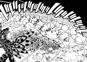 |  |
Edited by StalkerGamer on Aug 21st 2023 at 6:41:04 AM
 he/him | Image Pickin' regular
![]() Sure, I guess.
Sure, I guess.
Back in 2019, I upgraded the image on Cast Full of Pretty Boys from this:

to this:

Then last year, eroock changed it to the current image:

I don't really think that's an improvement, though. It's too bright and cropped oddly.
Keet cleanup
He/Him
![]() The second one (your upgrade) is better. Revert.
The second one (your upgrade) is better. Revert.
I find 2 too blurry, that's why I replaced it. 1 is actually the best of those. Not sure why it was switched.
Here's a quality upgrade of 2:

He/Him
OK changed my mind, yeah this ![]() is good
is good ![]()
he/him | Image Pickin' regular
![]()
![]() Yeah, that's the best one. Swap it in.
Yeah, that's the best one. Swap it in.
He/Him
I don't know if this is too drastic enough to warrant a thread, but the image of Kingdom of Loathing is really small. I have essentially the same image, but bigger and with text. Is this just a standard upgrade or should I make a thread?
Current:

Upgrade:

 The Rather Large One (they/them)
he/him
The Rather Large One (they/them)
he/him
Spider-Man Beyond has a landscape image (double-sided comic cover) that doesn't look ideal at wiki size.
Current version:

Is it worth swapping this for the omnibus edition cover?

Slightly larger image of the heroes, and better quality, but the main benefit is moving the text off the image and into the black borders.
If so, is this still close enough to qualify for this thread's scope? Or should I start a new thread...
...or is it worth completely ditching it and looking for another image using portrait orientation art, which won't be so small?
Edited by Mrph1 on Aug 26th 2023 at 8:00:03 PM
The image of Pokémon Sleep is fine, but the slogan on top adds more to the awkward whitespace in the upper left corner. So I'm thinking of moving that to the caption box like this:
The whitespace is still there, but it's better than nothing.
Edited by TroperNo9001 on Aug 18th 2023 at 5:16:47 PM
"I just want what everyone else has, that's all."