 Hi
Hi
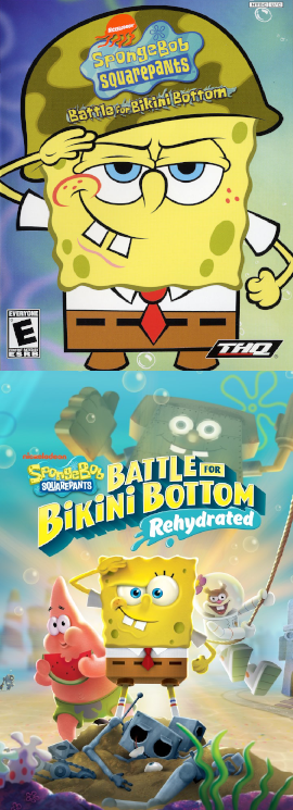
The original pic was just the one on the left of the current...voting to revert.
 Very Spooky
Revert both the main page and the Nightmare Fuel page.
Edited by jandn2014 on Apr 27th 2020 at 1:20:54 PM
back lol
Hi
Does anyone have any other suggestions to offer for the NF page, or is it good as is?
 Veteran Editor IV
The image idea for NF is good, but it'll certainly have to be replaced with something without a watermark. Other than that, I generally approve of reverting here, following a remake/rerelease isn't always necessary.
Currently mostly inactive. An incremental game I tested: https://galaxy.click/play/176 (Gods of Incremental) he/him | Image Pickin' regular
I'd actually prefer having the original and remake images side-by-side. Here they are, higher quality and 350 pixels wide:

Very Spooky
![]() Maybe make them vertically-stacked instead? The “Battle For Bikini Bottom” text on the original game’s cover is too small.
Maybe make them vertically-stacked instead? The “Battle For Bikini Bottom” text on the original game’s cover is too small.

I don't see the need to have both cover arts for the image. Just one, the original in this case, is fine.
he/him | Image Pickin' regular
 Veteran Editor IV
I too prefer horizontal. I also think that since the boxarts are very different and there I don't see a problem with using a two-part image like this, I'd be fine with using 7.
Currently mostly inactive. An incremental game I tested: https://galaxy.click/play/176 (Gods of Incremental)
I like 10, the names of the games are a lot clearer there.
Edited by iwantedtoaddsomething on Apr 29th 2020 at 8:29:29 AM
mwop
he/him | Image Pickin' regular
![]() It would be way too long, though.
It would be way too long, though.

Yeah. Honestly I like the horizontal version better. The vertical one just feels way bigger/messier than it needs to be, though I can't really explain why.
Still don't see the point of having both covers.
 Sounds good on paper (he/him)
I'm leaning toward just having the original version's cover, since the fact that it's simpler means it would be clearer when zoomed out. The SpongeBob SquarePants logo barely legible in the horizontal version (especially for the remake's cover), and the SpongeBob logo is still hard to read on the remake's cover in the vertical version. (I use a notebook PC with a small monitor; I'd imagine it's worse on mobile.)
Edited by GastonRabbit on Apr 30th 2020 at 4:41:14 AM
Patiently awaiting the release of Paper Luigi and the Marvelous Compass.
Hi
+1 for just the original.
Veteran Editor IV
Admittedly, putting both the original and the remake in one image decreases chances of the remake getting it's own page if necessary, or at least a folder for it. May as well go with just original here.
Any concerns about the Nightmare Fuel page, despite having a great image conceptually, being watermarked?
Currently mostly inactive. An incremental game I tested: https://galaxy.click/play/176 (Gods of Incremental) Filthy casual
I'd go for having just the original.
(Annoyed grunt) he/him | Image Pickin' regular
Who cares if the SpongeBob logo isn't legible? Everyone knows it's a SpongeBob game from reading the page title.
Keet cleanup
Weren't you the one that insisted the image for NiGHTS into Dreams… feature its logo, even though the full, clean art![]() ◊ was available?
◊ was available?
Veteran Editor IV
Thanks for fixing that NF page. As for logos, I can go either way (I usually think images look better with the official logo, though company/rating logos in the bottom corner are a tiny annoyance).
Edited by Piterpicher on Apr 30th 2020 at 6:33:16 PM
Currently mostly inactive. An incremental game I tested: https://galaxy.click/play/176 (Gods of Incremental) Hi
Hi
Clock is set.
he/him | Image Pickin' regular
![]()
![]() I also generally prefer images that show the work's logo if it has a unique logo. Primis, I did express preference for the NIGHTS image having a logo here,
I also generally prefer images that show the work's logo if it has a unique logo. Primis, I did express preference for the NIGHTS image having a logo here,![]() but on the IP thread for Adele Hasn't Had Her Dinner Yet I thought the image shouldn't include the title since it's just in a generic font, but was outvoted.
but on the IP thread for Adele Hasn't Had Her Dinner Yet I thought the image shouldn't include the title since it's just in a generic font, but was outvoted.
Crown Description:
Nominations for replacement images:
Directed here from this Ask the Tropers query: https://tvtropes.org/pmwiki/query.php?parent_id=87196&type=att .
.
The page image for SpongeBob SquarePants: Battle for Bikini Bottom got unanimously changed by a troper named Goog213. Should it be reverted back? Or should we suggest new images since the remake is just two months away?