 Hi
Hi
Either's good, leaning toward 1.1.

Prefer 1.2 for brightness and focus.
 Very Spooky
![]()

1.2
The universe is under no obligation to make sense to us. ❀ Mint, Nuts, and Waffle ❀
1.2 is more visible. While not a factor, the alicorn also looks cute.
Come play Character Uplift Game!
1.2
Jawbreakers on sale for 99¢ Filthy casual
1.2.
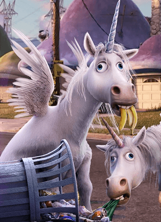
(Annoyed grunt)1.1 has a stronger indication of unicorns being a species of vermins. 1.2 could be mistaken for a single fallen-on-hard times unicorn.

Yes, 1.1 is more illustrative, but 1.2 has better quality.
The universe is under no obligation to make sense to us.
Edited by eroock on Feb 14th 2021 at 11:23:21 AM

Leaning for 1.2 over 1.1 (or the brightened version above)
For a caption, maybe "Help reduce the stray Winged Unicorn population; de-horn and save lives!"
Edited by Earnest on Feb 14th 2021 at 11:23:16 AM
 Goku Black
1.1 brightened version.
"That's right mortal. By channeling my divine rage into power, I have forged a new instrument in which to destroy you."
Hi
I don't like the brightened version of 1.1 at all.

 Very Spooky
![]() The close cropping looks awkward, IMO. I'm still like 1.2 best.
The close cropping looks awkward, IMO. I'm still like 1.2 best.

1.2 has the best color contrast and cropping. One more vote for it.
I don't like 1.2 at all. It doesn't look like a vermin species out of context, it just looks like one drugged out unicorn.
And 1.1 looks like two drugged out-unicorns...?
I personally think “vermin” in the title gives enough context for it to not be a funky single unicorn-shaped case.
Very Spooky
Here's a crowner![]() , just so we can get this done with.
, just so we can get this done with.
Hi
![]() Hooked, thanks.
Hooked, thanks. ![]()
Hi
Votes bump; two in the green right now.
Crown Description:
Nominations for replacement images:
From Onward.