 Hi
Hi
I can read it, but the words are so dark that it's unhelpful. 1.1 is pretty good...there's something about 1.2 that I don't care for.
 Very Spooky
Not a fan of the current, but both suggestions are Character Customization, not this trope.
back lol
![]()
 The Unknown
![]()
![]()
I could live with BUPKIS on this one if we can't find a good lampshade.
If a tree falls in the forest and nobody remembers it, who else will you have ice cream with?
I think a simple character select screen could work.


Edited by Drope on Feb 14th 2021 at 4:30:09 AM
 Overpowered
As a fan of Neverwinter Nights, the text hasn't aged well - don't we also have a rule against too much text in images?
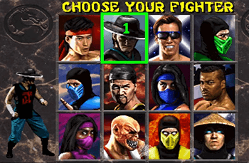
Anyway, liking the character select images - the Mario Party and Mortal Kombat are the best ones, since they're pretty concise about selecting a character.
Very Spooky
![]()

 Hi
Hi
Clock is set.

6.4.
Jawbreakers on sale for 99¢

 Explora Colores
Hi
Explora Colores
Hi
Crowner's hooked.
 Gentleman Troper!
Regarding 6.4, how do people feel about cropping out "kombat zone: rooftop"?
Rhetorical, eh? ... Eight!
![]() While not necessary for depicting the trope, I feel it adds a nice balancing gray frame that pairs well with the top.
While not necessary for depicting the trope, I feel it adds a nice balancing gray frame that pairs well with the top.
Hi
![]()
![]() I can take it or leave it.
I can take it or leave it.
Very Spooky
![]()
![]()
![]()
![]()
![]()
 Hi
Hi
No caption discussion for a couple of days; locking up.
Crown Description:
Nominations for replacement images:
The letters are too small to read on my screen.
Googling up "create your character" brings up tons of similar screens that are clearer and not all-text, for instance this one ◊ or that one
 ◊.
◊.
Rhetorical, eh? ... Eight!