 Hi
Hi
I think that’s way too subtle...no suggestions ATM.
 That's Dr. Title, thank you!
![]()
![]() Hobbes has a decent poker face. He has a horrible poker tail.
Hobbes has a decent poker face. He has a horrible poker tail.
This is a case where a caption can't hurt to point that out.
 he/him | Image Pickin' regular
![]() Yeah, change the caption to something like that.
Yeah, change the caption to something like that.
 Short-Term Projects herald
I would have voted to pull, but I did not notice the tail until you all pointed it out.
I want to grab some screenshots from this scene, provided that a high-quality version can be found:

There's a few suggestions in an old thread![]() for Blatant Lies that probably fit this trope better:
for Blatant Lies that probably fit this trope better:
1.
2.
3.
There's also this![]() ◊ animated version of the Ranma suggestion (it needs to be converted into stills, though)
◊ animated version of the Ranma suggestion (it needs to be converted into stills, though)
Edited by Adept on May 2nd 2020 at 12:14:10 AM

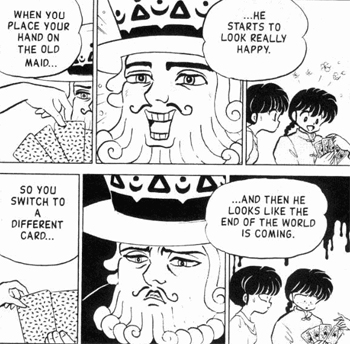
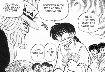
I'm split between 2 and 3. There's a lot of lampshading on the focus character's bad poker face in 3, but 2 has a good amount of context behind the guy's lack of a poker face. Would 2 be good even if not everyone may know what an Old maid is?
Edited by Unnerving_Posterior on May 2nd 2020 at 4:54:23 AM

To be honest - I think my preference would be to keep current, but add in the caption from 2. It feels like the most clear/consise to me, so long as there's that note pointing out the tail.
Edited by rachiebird on May 3rd 2020 at 1:34:13 AM
A caption is badly needed for current.

The current with improved caption or 6.1. The others rely too much on text.
The universe is under no obligation to make sense to us.
What the hell? I didn't even notice Hobbes's tail in the current pic.
![]()
![]() The current relies solely on text that the visuals are almost negligible. Hobbes' tails aren't as indicative as the facial expressions in the other suggestions.
The current relies solely on text that the visuals are almost negligible. Hobbes' tails aren't as indicative as the facial expressions in the other suggestions. ![]()
Edited by Adept on May 12th 2020 at 5:54:06 PM
Screencaps for 5


Edited by eroock on May 12th 2020 at 3:00:17 AM
![]() I can live with the first one.
I can live with the first one.
Hi
![]() Agreed...both are good but that one sells it more.
Agreed...both are good but that one sells it more.
That's Dr. Title, thank you!
Is there a reason we can't do both? I think the change in expression emphasizes how poor a poker face she has.
![]() Because she's clearly reacting to the same card in that particular example, so it's not really showing any contrast (unlike, say, the suggestions in 6). Also, why use two pics if using only one works just as well?
Because she's clearly reacting to the same card in that particular example, so it's not really showing any contrast (unlike, say, the suggestions in 6). Also, why use two pics if using only one works just as well?
 Veteran Editor IV
I have to agree. I never saw anything wrong with multi=part images myself, and both parts of 13 seem to show it more clearly (I myself would only see 13.1 as her being afraid of someone just making contact close to the face, rather than specifically pulling a card).
Currently mostly inactive. An incremental game I tested: https://galaxy.click/play/176 (Gods of Incremental)
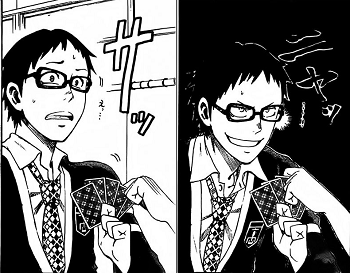
13.1 by itself works, but I prefer 6.1 over 13.1+13.2. Both are reactions to someone taking a card, but the contrast in the former (distress + smug confidence) is much more whiplashy and no-pokerface-y than the latter (distress + further distress).
Two-panel variants
 |  |
Edited by eroock on May 12th 2020 at 7:24:48 AM
Short-Term Projects herald
![]() 20.1. Pretty much what I was thinking.
20.1. Pretty much what I was thinking.
Veteran Editor IV
![]() 20.1 (the first panel shows it's about the cards well enough and it's clear).
20.1 (the first panel shows it's about the cards well enough and it's clear).
 Very Spooky
![]() 20.1.
20.1.
http://brawlinthefamily.keenspot.com/comic/96-captainfalconplayspoker/![]()
Top row maybe? Could make the caption "I call." to include the punchline in some fashion too.
13.1 works. No need for the second panel, it doesn't add much extra.
The universe is under no obligation to make sense to us.
Crown Description:
Nominations for replacement images:
Can’t really tell what's supposed to be going on here. Calvin’s holding a perfect poker face, so I guess Hobbes’s supposed to be the example, but his expression is rather subtle. Are there any better suggestions?