The Trope Codifier is The Beatles' self-titled 1968 double album, whose blank white cover is embossed with the name of the band. It is far better known today as The White Album.
The Monks' Black Monk Time is similar, except in black with gold text, and predates The White Album by 2 years.
The cover of Metallica's self-titled album simply consists of the band's logo and a sketch of the snake featured in the historical Gadsden flag, which are just barely visible against the black background. For this reason, it has gotten the Fan Nickname of "The Black Album".
Prince's untitled 1994 album (originally recorded in 1987 before being shelved) also gets the name of "The Black Album" from its all-black cover, save for the catalog number written on the spine. For the album's CD version, a hype sticker was placed on the jewel case to let buyers know what it was.
John Lennon and the Plastic Ono Band's Live Peace in Toronto 1969 has a picture of a blue sky with a cloud.
Back in Black by AC/DC is simply the band logo and album title in gray against a black backdrop.
So Far by Faust.
The censored version of Smell the Glove by Spinal Tap is the mother of all black sleeves, being solid black with no distinguishing features. Metallica said they were inspired by it for their album.
The Songs: Ohia album Ghost Tropic has just the album title on a black background.
Danger Mouse's ''The Grey Album'' is here to balance it out. Especially when it incidentally happens to have sampled The Beatles' ''The White Album, mixed with the vocals of Black Album of... Jay-Z's. Whose black album was less fitting for this trope.
The 1989 Gumby tribute album. It's officially titled "Gumby" but its cover art design (a homage to The White Album) practically makes it The Green Album (not to be confused with The Muppets' Green Album).
The original version of Disturbing The Peace by Alcatrazz is almost completely black aside from the band's logo, the title, and some faint images of cell bars.
Peter Saville is a massive enthusiast for this trope, preferring to design cover art that presents musicians as what he calls mass-produced open secrets. Coming after the decline of Progressive Rock and its penchant towards the Design Student's Orgasm, Saville's work helped bring this trope into mainstream popularity; links to Main/PeterSaville redirect here for a reason.
His first big splash was Unknown Pleasures by Joy Division, simply a small white diagram of pulsar waves against a black backdrop. That being early work, he actually put the band and album name on the sleeve (in small print on the back).
He quickly grew out of this, of course. New Order's first big hit single, "Blue Monday," had the band and song names only as a colour code, with the rest of the sleeve being a die-cut floppy disk design. The accompanying album, Power, Corruption & Lies, only had the catalogue number, FACT-75, on the cover— as text on the spine and, of course, colour code.
The cover of New Order's Brotherhood is a a photo of zinc-titanium alloy. Waiting for the Sirens' Call nearly two decades later goes to even further extremes by just being the word "No" (as in "New Order") in large orange type against a white backdrop, with the band name and album title tucked away in the corner in small print.
Saville pushed design well beyond reasonable limits. The die-cut cover for "Blue Monday," meant to resemble a floppy disk, was much more expensive to produce than a standard cover and reputedly lost money on every copy sold ... this became problematic when it turned out to be a hit.
He also caused many (quite financially important) New Order releases to be delayed because he took so long to come up with the perfect sleeve. He would be so late they would say "just get it to the printer!" without the label or band even seeing it.
Saville also designed the cover art for prog stalwart King Crimson's comeback album Discipline, with his work being so striking that the band had other designers make their own versions for Beat and Three of a Perfect Pair.
The sandpaper sleeve of the first pressing of The Return of the Durutti Column was not Saville, but Tony Wilson, the head of Factory. Now you know what level of freedom Saville had there.
The front cover art of most of The Young Gods' releases are mostly just the band's name engraved on a different background. Their Only Heaven is an even straighter example.
This trope (or at least one variant of it) would be alternatively be called The Designed Republic, after the late graphic design studio who tended to produce covers like these. They have now found success in 2014 with their very minimal design for Aphex Twin's Syro
The cover art they did for Autechre deserves mention. The one (formerly) pictured comes from their Tri Repetae. And yes, the cover doescompletely look like that.
Quaristice.Quadrange.ep.ae apparently seems like a Shout-Out to Kazimir Malevich's Black Square, don't you think?
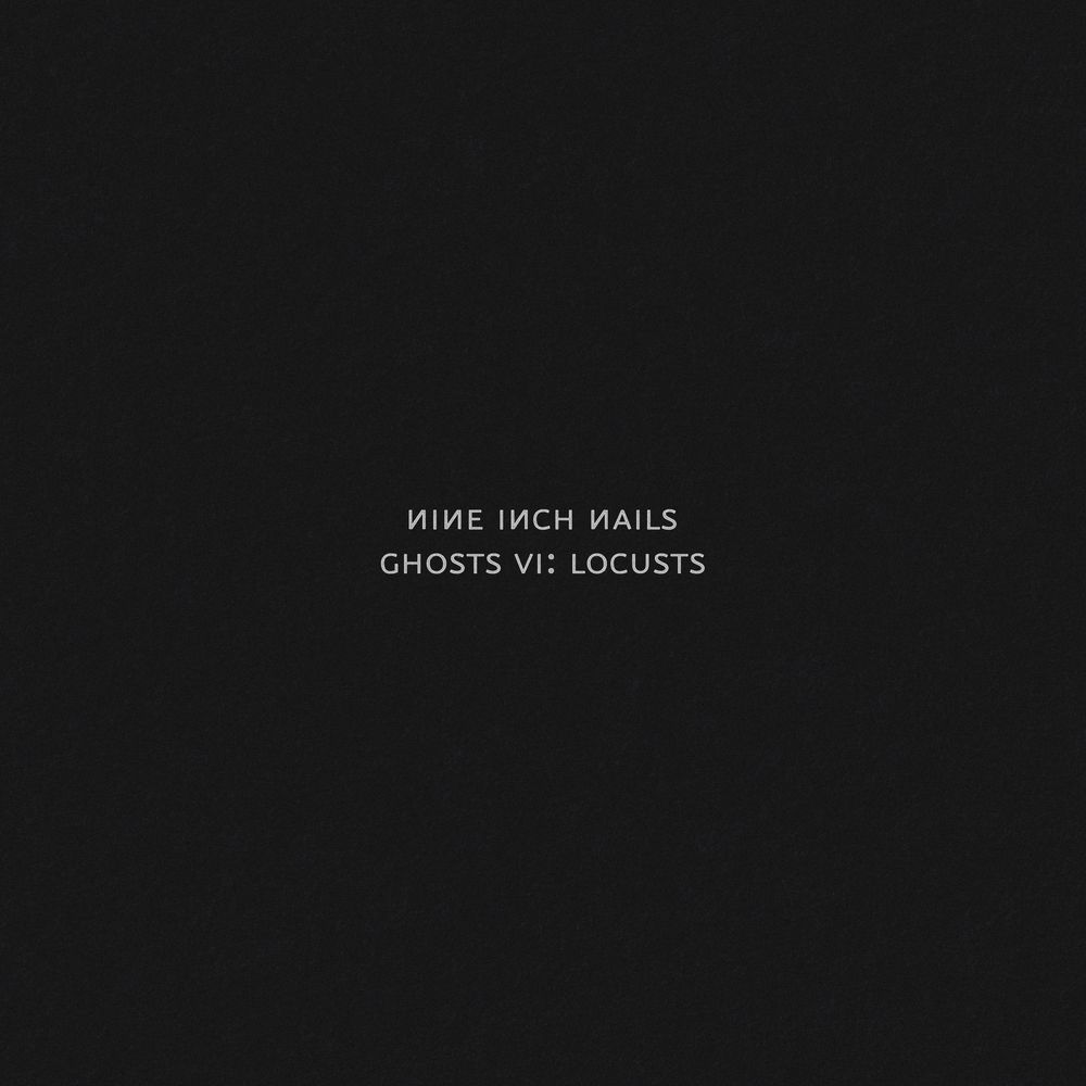
Trent Reznor apparently loves these. Special mention goes to the Rob Sheridan-designed ones.
The cover of Fantasies shows only a lightbulb against a dark background.
Art of Doubt is even more minimalistic, featuring nothing but an abstract circle shape on a black field.
Franz Ferdinand's debut Franz Ferdinand (2004) is just a black cover with a slightly stylized typeset of the band's name. They initially planned to do it for all their albums. They continued it with their second album You Could Have It So Much Better, but they were then required to start naming their albums after that, much to their chagrin.
Alex Kapranos: "The whole point is that the album doesn’t have a title.... The albums are going to be identified by their colour schemes rather than a title."
Sloan: The album cover for Between The Bridges is essentially a wide shot picture of the band with a grayish tint with the band name and album name near the top.
Starflyer 59 has played with this to various degrees.
Four of their albums had solid monochromatic covers, with no text: Silver, Gold, Americana (red cover), and I Am the Portuguese Blues (metallic blue cover). The Everybody Makes Mistakes cover was yellow, with small text running along the left margin, and a large 9 as a false watermark.
The album Dial M doesn't count, but covers of associated releases—the single "The Brightest of the Head," and the Minor Keys EP—just feature blocky white and red text on a black background.
Side project: The Right Amount by Bon Voyage was a light bulb against a black background. The only text was on a removable sticker.
Speaking of Starflyer 59 and Joy Electric, their collaborative album The Brothers Martin just had a simple line drawing diagram of Earth's magnetic poles as the cover.
Alternative rap group Giant Robot released an album entitled 33 rpm Robotics. The cover? An up-close photo of cardboard.
Close to the Edge made up for its minimalist exterior by having a Roger Dean painting on the inside of the gatefold.
Do You Know Squarepusher by Squarepusher. The guy was incidentally signed to the record label The Designers Republic themselves were somewhat involved on, nonetheless.
Cover of Justice's (the French electronica duo) debut album Cross consists solely of the glowing cross on a black background.
The cover of the second print of his Come to Daddy is just the white "An image of children chasing after an ice-cream from an Orange? TV commercial advertising Text messaging." text on an orange background. Again, The Designers Republic did it.
And Chosen Lords.
Selected Ambient Works 85-92 is just the logo, artist, and album name. Richard D. James Album may also qualify.
Not counting the band name and album title labels, their Filth don't feature much besides the angry teeth on a black background.
Their Love Will Tear Us Apart◊ EP has an all-red cover with text only on top and bottom of it.
The Seer, To Be Kind, and The Glowing Man each have a single image against a blank background. The Seer has a grinning, beady eyed fox creature, To Be Kind has a crying baby's face, and The Glowing Man has weird red symbol resembling an arm.
Coldplay's X&Y, (plus every single from that album) as well as their only (so far) compilation album.
Every LFO album has a pretty abstract cover, with Sheath being the most fitting to the trope.
Orbital's album Middle of Nowhere has a cover consisting of a big "O" and a walking man, with a very small text accompanying some versions of it.
The Hurting: A child weeps in the corner against a solid white backdrop, punctuated only by the band and album logotype.
Live at Massey Hall: It's basically the Canadian flag (minus the red bands on the sides) with a stylized white tree serving as the maple leaf's "veins." Simple, yet elegant.◊
While Radiohead usually go for the opposite extreme with their album covers, Amnesiac is just a little red book with a tiny doodle of a crying minotaur on it, set atop a solid black background; the band and album logotype are shoved off to the corner in tiny lettering. Even better if you have the limited edition, which is the red book.
The censored cover of tool's Undertow consists of a big barcode on a white background. The regular cover counts as well, depicting only a stylized, deep red ribcage against a black background.
The cover of Pinebender's Too good to be true is mainly a blue grid paper so you can draw your own cover art on it. The album's first pressing even included a pencil tucked under the CD tray.
Beck's The Information does the same, except that it comes with stickers (perhaps you could always get your own pencil if that wasn't enough).
Public Image Ltd.'s Album. Or Cassette. Or Compact Disc, depending on the format. In all three cases it's just the title written in large letters across a solid background, puncutated only by a horizontal line and the band logo in the corner.
The band Flipper called PiL out when they felt the latter ripped off the former's similarly minimal artwork for Album - Generic Flipper. Which is ironic considering that the cover of the Flipper album is strangely reminiscent of Gang of Four's untitled EP, commonly known as Yellow EP.
If anything, the PiL cover is an homage to Repo Man.
The cover to Animal Collective's Merriweather Post Pavilion is a green and purple tessellated pattern with no text, although there's a little more to it because it's meant to produce an optical illusion when stared at. When the band made a musical appearance on The Late Show, David Letterman held up their record and joked that it was available "in wallpaper stores everywhere."
Animal Collective's albums Strawberry Jam, and Hollinndagain, the EP's Prospect Hummer, and Fall Be Kind, and the single Summertime Clothes were all also textless.
REO Speedwagon's You Can Tune a Piano, But You Can't Tuna Fish: A large photo of a dead fish with a tuning fork in its mouth against a blue background, with the band name and album title in very small text at the top and bottom.
The 2019 Rammstein album is just a picture of a match on a white background. And the album itself doesn't even have a title (it is usually just listed as Rammstein).
The Police's Ghost in the Machine features the band's faces rendered as a segment display against a solid black backdrop, with only the band name and album title in plain white text to accompany it.
Few Groove Armada albums are this, especially Black Light◊.
EP001◊, the debut EP of Dhani Harrison's (George Harrison's son) thenewno2 project.
Every release from experimental drone band Growing to date have not had any text on the artwork, whatsoever.
Boredoms' Vision Creation Newsun consists solely of a picture of a young child in front of a sun glare. The limited edition box set of the album had artwork that consisted of nothing but simple vector shapes.
The Secret Machines have released several albums with minimal artwork, notably September 000, which is simply a blue circle on a white background, with black text of the band name in the lower corner. The iTunes release of the album did not have the black text, leaving the artwork simply as the large blue circle.
Brian Eno seems to be a fan of this trope as well:
This extends to his collaborations as well, like in Evening Star◊ with Robert Fripp and the aforementioned U2 album.
German Krautrock duo Cluster also have a few albums like this, notable among which is Grosses Wasser◊. And let's not even mention their collaborations with Eno himself.
King Crimson's album covers from 1981 to 2000 indulge in sparseness. In particular, the three albums they put out in the '80s (Discipline, Beat, and Three of a Perfect Pair) consist of nothing more than the band name and album title in plain text and a symbol atop a solid-color background.
The Velvet Underground & Nico is simply an illustration of a yellow banana atop a solid white background; some reissues vary it up by adding the album title in bold text.
White Light/White Heat consists of a faint image of a tattoo against a solid black backdrop, with the only other element being the band name and album title in white text.
Todd Rundgren's Faithful came in a plain, beige cover with just the album title and Todd's name in lowercase letters across the top.
The cover for the XX's self-titled debut album appears to be a white "x" on black background. Actually it's die-cut and the CD booklet is white. Second album Coexist does the same thing with an inverted color scheme, though there's a rainbow streak like you sometimes see in oil slicks going up part of the "X." All of their singles so have also followed suit, with different patterns on the booklets.
Introducing Sparks is just a bust shot of Russell or Ron, depending on which side you're looking at, against a blue background with the album title. Said bust shots are combined in this page's image above.
No. 1 in Heaven has a women in a white lab coat holding a microscope against a flat, white background.
Balls is just a colored circle on a gradient background.
Lil' Beethoven is mostly text except for a miniature Beethoven cartoon in the corner.
Dr. Dre's 2001 is simply the artist name, the album title, and an illustration of a pot leaf, all of which is tucked in the corners of the cover and laid atop a black backdrop.
The Dire Straits album Making Movies is mostly just solid red, with a turquoise notch off to the side revealing the band name and album title in small white text.
After The Rolling Stones' label rejected their original cover for Beggars Banquet (which featured Bathroom Stall Graffiti), they substituted a plain white cover, done up as a mock "R.S.V.P." invitation card. When the album was reissued on CD in the '80s, the graffiti cover was used instead.
Spiritualized has several minimalist covers, but Sweet Heart, Sweet Light takes the cake: A white background, a green, octagonal outline, and the blue sans-serif text, "Huh?" Frontman Jason Pierce designed the cover, partly because he wanted something that would still look good when shrunk down to a 100 pixel thumbnail, and partly because Huh? was what he originally wanted to name the album.
Green Day's American Idiot cover is supposed to invoke this. It may not be completely minimalistic, but compared to earlier albums such as Dookie and Insomniac, it counts.
Lupe Fiasco'sFood and Liquor 2: The Great American Rap Album pt. 1. The album is completely black. No, not just the front cover. The entire album. The cover of his "Friend of the People" mix-tape also counts having just the word "JESUS" in solid white letters on a black background.
Avenged Sevenfold do this every two albums. Waking the Fallen had a grey deathbat on a black background, Avenged Sevenfold a black deathbat on a white background and the second cover of Hail to the King half of a white deathbat on a black background. Sounding the Seventh Trumpet, City of Evil, Nightmare, Hail to the King (original cover) and The Stage have much more elaborate designs.
While most of Pink Floyd's album covers tend to be pretty elaborate, they have utilized minimalism on a few occasions, those being the iconic prism illustration for The Dark Side of the Moon (whose cover came about thanks to keyboardist Richard Wright's requests for something "smarter, neater — more classy"; he also said on record that he wanted something "simple and bold"), the blank white brick wall for... well... The Wall (though re-issues do reduce the minimalism a little via the addition of large black/red text), and the remembrance poppy and military stripes in the corners of The Final Cut's cover.
The album art for Meddle and Atom Heart Mother are also comparatively minimalist by Pink Floyd's standards, though are a bit more milder examples of this trope.
Neu!'s album covers are all different variations on the same basic concept: a scrawl of the band's name atop a solid backdrop. All four covers are low on detail, with the most coming from the spray-painted 2 on the cover of Neu! 2 and the roadlike shape of the scrawl on Neu! 4.
Kraftwerk's second album: a green/white traffic cone with "Kraftwerk 2" in stenciled letters.
Silkworm's Italian Platinum: the band name and album title in small print and all lowercase letters over a white background, with two lines of barely visible light blue asterisks above and below the text. The album's All Music Guide review speculates that it's supposed to look like the cover page to "someone's 10th-grade English paper."
The cover of 808s & Heartbreak consists of some text and a heart-shaped balloon on a light grey background. It was recycled for the album's single "Heartless", which removed the heart, thus leaving it just text and grey.
My Beautiful Dark Twisted Fantasy features a small, crude painting of either West being straddled by a naked harpy-like figure (the main official artwork) or a ballerina dressed in black (an alternate version used in physical retail copies) among a pure red background. The album's internal packaging continues this pattern with a variety of other paintings.
The CD-exclusive Yeezus doesn't even have a proper cover. In physical form, there's just a transparent jewel case with a piece of red tape sealing it, a plain CD, and a text-only tracklist on the back. The cover specifically used for its digital release (a photo of said packaging) pretty much reflects the same thing. According to West, the simplistic packaging was intended as an "open-casket funeral" for the Compact Disc, which by the album's release in 2013 had fallen far from its sales peak in 2000.
West's scrapped album Yandhi was proposed to have a cover similar to that of Yeezus, but with a MiniDisc and a lavender tape.
The cover for Jesus Is King (the final product derived from Yandhi) features a blue LP record on a plain white background. The album's vinyl release reflects this with a blue disc in a clear sleeve, and a card with a white backing that has the tracklist.
After West tossed around a couple elaborate illustrations as potential album covers, the final release of Donda simply has solid black, textless packaging.
Donda 2 is probably the most extreme case yet for West, as due to the nature of the album itself (it was released exclusively through digital download via a custom Stem Player product), there's no actual packaging to support the already simplistic cover art (a small house on fire within a black background), and as a result, it's straight-up nonexistent.
Aleph by Gesaffelstein does a similar thing to Yeezus, with a clear cover with no artwork, covered by thin white lines that look like a circuit board, the Hebrew letter for "aleph" at the center, and the CD itself is plain gold with no text on it. His sophomore album, Hyperion, ups the ante even further: the cover is entirely black.
Sigur Rós' album (), also known as Untitled, is all white with the parentheses in a slightly less glossy white.
Every album (as of 2022) by The Field. From Here We Go Sublime, Yesterday And Today and Looping State Of Mind look almost exactly alike, with the band name, album title, and a tiny logo for the record label printed in a handwriting-like font over a solid off-white background - the only differences between albums are that the text is in different colors, and the background is a slightly different shade of off-white. Cupid's Head and The Follower introduced a variation on the theme by using black backgrounds: The former had black text on a black background note the digital version substituted white text so a thumbnail version of the art would still be readable and the latter had white text.
The artwork of Digitalism's second album, I Love You, Dude, is just a black, heart-shaped octagon on a white background with the band and album name in simple text on the top left.
Lorde's Pure Heroine. The cover is completely black with nothing but the name of the artist and album.
Seventeen Seconds by The Cure: a heavily motion-blurred photo of some trees that only occupies the very bottom of the image.
Fugazi's compilation 13 Songs, perhaps meant to go with its Exactly What It Says on the Tin title: The band name and album title in black over a solid red background. It's nearly the same design as the self-titled EP (which is included in the compilation), but that one doesn't qualify because it also includes a black and white picture of Ian MacKaye singing while hanging upside down.
The charity album Songs for Japan, simply the title atop the flag of Japan, itself just a solid red circle against a solid white backdrop.
The cover to Drake's If You're Reading This It's Too Late is just the title on a white background, which one Twitter user described as "a suicide note from the Chick-Fil-A cows."
The cover of the original recording of Benjamin Britten's War Requiem consists only of white text on a plain black background. This was because producer John Culshaw considered none of the designs Decca Records' art department came up with to be serious enough.
Complete Clapton by Eric Clapton just features the album title and his signature in red-and-white text against a black background.
Lightning To The Nations by Diamond Head was originally self-released in a limited run of autographed plain white sleeves, with no text beyond the band members' signatures. Their manager owned a cardboard factory and could cheaply produce such sleeves, plus the album was only being sold at concerts or via mail order, with the hope that a label would sign them and re-release the album on a wider scale. Since then there have been several reissues on different labels, all with different artwork where the trope no longer applies.
The cover to Del the Funky Homosapien's Future Development seems to be based off paper sleeves for floppy disk computer games: It's mostly white, with the title and artist name in black and the only other images being a pair of vertical blue lines and a small, 8-bit silhouette of Del himself firing a Mega Man-esque armcannon.
The album Untitled Unmastered by Kendrick Lamar features cover art that is simply a shade of dark green with the album's name in the top left corner in a white font and one of the explicit Content Warnings that are associated with foul language in music in the bottom right. Similarly all the tracks on the album are very uniform and are all named untitled followed by the order in which it plays on the album and a date.
Obituary's self-titled 2017 album features the band's logo, in gold with a bit of touch-up, against an entirely black background. Particularly notable in a genre (Death Metal) that normally goes for hyper-elaborate, frequently Gorn-laden album art, something Obituary themselves have done before.note their previous album, Inked In Blood, featured the band logo carved into the chest of a dismembered, decapitated corpse, rendered in loving detail by the artist, with the album name in blood on the table the corpse is on; previous covers are similarly elaborate, if sometimes less gory
Polvo's sleeve for Today's Active Lifestyles looked fairly minimal to begin with when it featured a small, un-centered image of tigers on a solid yellow background... Then there was a copyright dispute with the artist who painted the tigers and they were removed from subsequent reissues,leaving mainly an expanse of mustard yellow◊.
Many of the releases by techno duo Pan Sonic had plain album covers. Some would consist of the name of the duo, a few would have the names of the releases, or in some cases both. These were all placed in front of a bright coloured background.
The album cover for The Future Sound Of London album ISDN only consists of the text "FSOL ISDN" on a white background.
Dwight Yoakam's dwightyoakamacoustic.net features just a sticker bearing the album's name.
The Caretaker has quite a few albums that fit this trope. Several parts of Everything At The End of Time have very little going on in their cover art, consisting of a single object sitting in a featureless room with zero text. Several more of the artist's albums also abide by this trope, such as An Empty Bliss Beyond This World and Persistent Repetition of Phrases.
Matmos' The Consuming Flame: Open Exercises in Group Form's artwork is just the band and album name in black text on a white background.
Oval's Systemisch features the band name in black text, the album name in white text, and track numbers on a bluish grey background.
James are quite fond of this trope:
Stutter is an abstract picture of a tinted yellow window. The full version is a little busier but still fairly minimalist.
The North America-only Self-Titled Album is just a picture of an abstract daisy with the band name at the bottom.
Seven is a picture of a fetus' legs.
Wah Wah is just the band and album name printed on a beige background.
Millionaires has a pig wearing a gold chain walking on a blue background, with nothing else besides the band and album name at the top.
Pleased to Meet You is definitely minimalist in nature, being just a black-and-white portrait of a man, but said man is actually a computer composite of all of the band members.
Hey Ma has a picture of a baby staring at a nearby gun, with the album name spelled out in toy blocks.
The Night Before has a purple/blue sperm cell of some kind peering at a crackling blue egg.
All the Colours of You is an abstract drawing of a head, with the band's famed daisy logo in the center.
Many Boris album covers are this by virtue of the sheer number of albums they've released, including the Heavy Rocks trilogy which features very similar covers, and even more so the trilogy that began with Urban Dance.
British folk rock band Lindisfarne had a smash-hit LP in 1971 with Fog On The Tyne. Their follow-up album Dingly Dell tried to evoke the big hit and the ambience of Fog on the Tyne by using a monotone grey LP cover. It didn't work as planned.
BLACKPINK has multiple, often using little more than the colors black and pink:
The standard cover of Born Pink is merely a pair of pink snake fangs (reflecting the song "Pink Venom") on a void background (black on the CD, identical to the "Pink Venom" single; light grey on the digital).
The cover art of Bird Machine by Sparklehorse is the album title in Mark Linkous' handwriting over a white background.
The Real Zebos' Strictly Platonic has a cover that's just a thick pink stripe over a black background.
 is similar, except in black with gold text, and predates The White Album by 2 years.