 No longer active.
Without a point of comparison, it's hard to see how this illustrates the horror being toned down.
Be kind. Professional Wick Checker
Would adding the movie's TV rating or an image from a Horror work next to one of the posters in OP make it more illustrative?

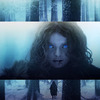
It looks pretty goofy and kid-friendly to me.![]() Why would you need a comparison to something like Se7en or Silent Hill?
Why would you need a comparison to something like Se7en or Silent Hill?

Agreed that the posters are fine on their own.

1.2 looks the best at wikisize.
I'd like to apologize for all this.
Remind me, what's the difference between this trope and the Spooky Kids Media trope? The laconics are not helping.
The impression I'm getting is that this is horror for kids, while Spooky Kids Media is when it's spooky-themed (like a vampire appears) but it's not horror.
Edited by Stage7-4 on Feb 19th 2023 at 6:22:02 AM
There's a solid case for duplication there, so I would support bringing Defanged Horrors and Spooky Kids Media to TRS.
That being said, since both pages are imageless right now, I think we can still select an image. Even if the tropes were to be merged, it wouldn't really affect the outcome of this discussion.
You've got roaming bands of armed, aggressive, tyrannical plumbers coming to your door, saying "Use our service, or else!"
1.2 looks the tamest (note that Norman is smiling while being surrounded by zombies), so that's another reason for being the best choice.

1.2 is cute. ![]()

I think the current posters (particularly 1.2) work without any point of comparison from a darker/more mature work. Even though they're pretty brightly colored zombies they're still pretty clearly zombies. I like 1.2 the best.

Yeah, 1.2 is good.
The universe is under no obligation to make sense to us. Unlucky rabbit's foot user
 Wild Child
Here's a version of 1.2 without the text.


![]()
![]()
![]()
Professional Wick Checker
My only problem is that the cropping of the original poster is a little weird, with the tip of the nose of the zombie on the right cropped off. Is there an alternate crop?
And I agree it doesn't need a comparison image.
EDIT: Here![]() is a better crop but it's behind a paywall.
is a better crop but it's behind a paywall.
Edited by Snicka on Feb 21st 2023 at 10:17:20 AM
No longer active.
On reexamination, I think 14 actually works better than I first thought. The juxtaposition of snarling zombies and a jovial-looking child do enough to indicate "child-friendly horror" without a point of comparison.
Be kind.
Professional Wick Checker
![]()
![]() I found it
I found it![]() ◊, but it needs its borders cropped. Although there's nothing wrong with 14 as-is, the crop isn't that bad.
◊, but it needs its borders cropped. Although there's nothing wrong with 14 as-is, the crop isn't that bad.
Wild Child
Is there consensus to use 14?
Why so serious?
Yep, missed this one. There's enough consensus for the idea; 14 is in and tagged. Caption?
No discussion, closing.
From ParaNorman.