![]() Looks better to me.
Looks better to me. ![]()
 Good freakin' griefer

 Owl House / Infinity Train / Inside Job Fan
![]()
![]()
 The Undercover Troper
![]()
![]() I was considering using the iTunes image for Season 4
I was considering using the iTunes image for Season 4![]() ◊, but I couldn't find a high-res version of it.
◊, but I couldn't find a high-res version of it.
 Just a guy.

[1]![]() ◊
◊
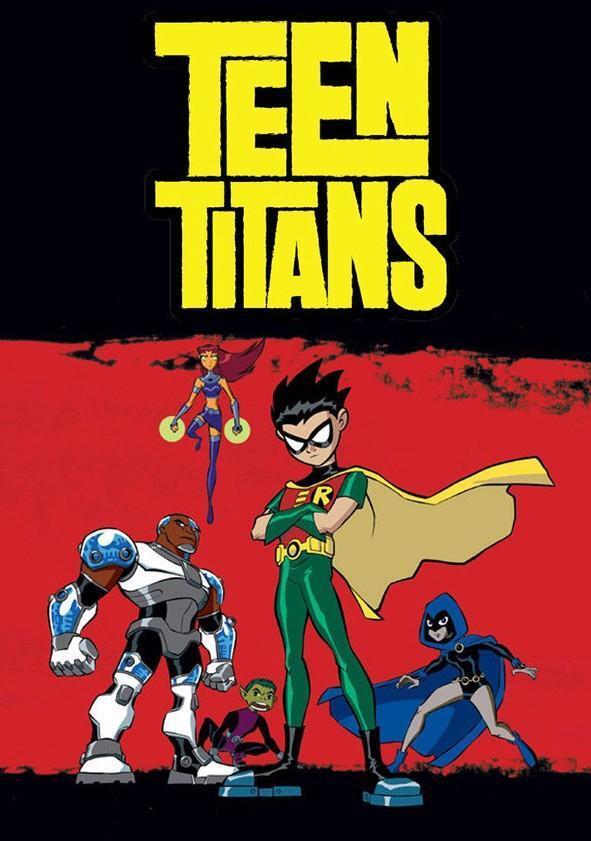
Probably looks more "formal" with the black and red color scheme.
Pretty sure Robin would prefer something professional-looking like this (given his personality in that show)
Edited by RobertTYL on Apr 7th 2023 at 11:14:01 PM
The Undercover Troper
![]() Edit: Converting it to wikisize.
Edit: Converting it to wikisize.
Edited by RWBYraikou888 on Apr 7th 2023 at 11:49:17 AM
Orcus on His Throne will always be my pet peeve. Unlucky rabbit's foot user


 Just a guy.
Still voting for 3, just looks more visually appealing than the others. Though I'm good with 8.
Edited by Tylerbear12 on Apr 8th 2023 at 11:59:24 AM
I prefer 8. The characters in 3 look weirdly off-model to me.
 Trans Siberian Anarchestra (it/they)
1 > 3 > all the rest.
No logo is better than everyone floating in front of an empty greenscreen.
Edited by Noaqiyeum on Apr 8th 2023 at 8:15:04 PM
The Revolution Will Not Be Tropeable
I actually don't mind the current. I like how they're all equally prominent, befitting the Ensemble Cast.

 Professional Wick Checker

 Hi
Hi
Crowner's hooked.

Votes bump, three in green and one in (super)consensus range.
Hi
8's moved into uncontested super-consensus. It's in and the tag's updated; locking up.
Old pic:

Crown Description:
The current is just the Core Team sans Terra atop a blank background, which is more befitting of a character page than a main page. Suggesting this image of the Titans placed in front of the Titans Tower for setting establishment.