 Mummy Woomy
Holy crap! Poe's Law is at full effect right here.
I agree with swapping the current image with this absurdity.
"Yeah, it's a shame. Here we are in an underground cave with all these lasers, and instead of having a rave we're using it for evil."
![]() I agree!
I agree! ![]()
edited 6th Apr '13 4:53:08 PM by Spark9
 Am I a weirdo?
I also agree. That new one is ridiculous.
Bigotry will NEVER be welcome on TV Tropes. No, the other one.
"Good luck killing them."
Check out my fanfiction! Hi
Hi
Here it is cropped to wiki size...I'm definitely down with this. One or two more votes and we can pin it.
 |
 Professional Writer & Amateur Scholar
You and your pun...
I'm a (socialist) professional writer serializing a WWII alternate history webnovel.
Hi
...what?
Professional Writer & Amateur Scholar
You said "pin it".
I'm a (socialist) professional writer serializing a WWII alternate history webnovel. Trans Siberian Anarchestra (it/they)
Hi
Trans Siberian Anarchestra (it/they)
Hi
<— is smirking right now.
Hi
I'm gonna go ahead and call this one. The new pic's up and tagged. Caption or no? "North Korean Boy Scouts really go all out." came to mind.
Trans Siberian Anarchestra (it/they)
"This way they don't need bulletproof vests."
The Revolution Will Not Be Tropeable
Professional Writer & Amateur Scholar
"Quick, we need a truckload of magnets!"
edited 6th Apr '13 8:20:00 PM by dRoy
I'm a (socialist) professional writer serializing a WWII alternate history webnovel.
Hi
![]()
![]() That's not bad, either.
That's not bad, either.

Too bad, I kind of liked the old one better. This is just so clearly 'Shopped. This![]() ◊ being the original. Also...it seems to me that only four hours passed between the suggestion and calling it, and four official votes for it...
◊ being the original. Also...it seems to me that only four hours passed between the suggestion and calling it, and four official votes for it...
edited 6th Apr '13 9:49:31 PM by helterskelter
Hi
![]() It's the extreme over-the-top-ness of the pic that sells it. The unshopped version is fine, it just needs to have the guy on the left cropped out to get it to wiki size.
It's the extreme over-the-top-ness of the pic that sells it. The unshopped version is fine, it just needs to have the guy on the left cropped out to get it to wiki size.
EDIT: Actually, the entire thing looks good at wiki size. I'm good with this one.
 |
edited 6th Apr '13 10:43:45 PM by Willbyr
Trans Siberian Anarchestra (it/they)
I'll be honest: it took me a bit to spot the difference between the 'shopped and un'shopped images.
The Revolution Will Not Be Tropeable
Professional Writer & Amateur Scholar
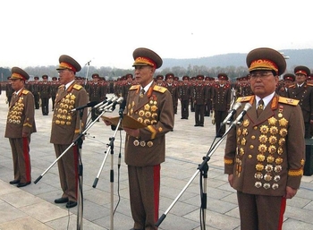
I think 6 is better because it shows more medals.
I'm a (socialist) professional writer serializing a WWII alternate history webnovel. In uffish thought
There also isn't the color contrast blurriness thing that the real one has. I prefer the 'shopped one, though if you could crop in the guy on the left that'd be good.
That was the amazing part. Things just keep going.@6 is OK for me (and I have no idea why it should be photoshopped). @17 looks kind of blurry and has less medals.
"For a successful technology, reality must take precedence over public relations, for Nature cannot be fooled." - Richard Feynman
Hi
Here![]() ◊ is the actual pic. Here's a different crop that includes a couple of the generals on the left.
◊ is the actual pic. Here's a different crop that includes a couple of the generals on the left.
 |
edited 7th Apr '13 6:25:19 AM by Willbyr
No, the other one.
![]() I like that one the most. I also prefer #17 over #6.
I like that one the most. I also prefer #17 over #6.
edited 7th Apr '13 6:36:24 AM by AnotherDuck
Check out my fanfiction!
Trans Siberian Anarchestra (it/they)
Professional Writer & Amateur Scholar
Looks good enough.
I'm a (socialist) professional writer serializing a WWII alternate history webnovel.
Current image is indeed excellent and has no problem.
However, I just found this image ◊ and I thought this would make an even better image, because it is colored and because of sheer ridiculousness.
I'm a (socialist) professional writer serializing a WWII alternate history webnovel.