If I knew which episode that was, I could check the series to see if the quality can be improved.

[1]![]() ◊ From Hidamari Sketch.
◊ From Hidamari Sketch.
If only this didn't have subtitles![]() ◊... from Railgun
◊... from Railgun
want some mad bull![]() from Persona 3
from Persona 3
edited 11th Dec '14 5:07:37 PM by Memers
3.1 looks fine for me, and definitively better than the current.
"For a successful technology, reality must take precedence over public relations, for Nature cannot be fooled." - Richard FeynmanI just like the current because of how much variety is being shown in the trope. Instead of one product, there's numerous all shown in one spot.
I found the shot in question. If I had a blu-ray player on my computer, i could probably get a slightly better quality pic, but... Well, here's the original:
and mine:

If you think another image would do better, I've no objections to replacing it.
edited 12th Dec '14 4:22:26 PM by DRCEQ
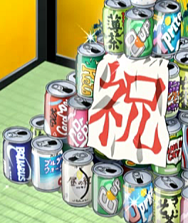
A majority are unreadable at that size.
edited 12th Dec '14 5:11:58 PM by Memers
 Zzzzzzzzzz
To me, the larger version there is fuzzier and more difficult to read. In the smaller size, I can read 6Up, 8Up, Tprite, UPrite, DrPep ( the rest is cut off by the banner), and what looks like Canada Cry .
...if you don’t love you’re dead, and if you do, they’ll kill you for it.
Seems legible to me. Prefer smaller, the bigger one is fuzzy.
Becky: Who are you? The Mysterious Stranger: An angel. Huck: What's your name? The Mysterious Stranger: Satan.
Zzzzzzzzzz
Although.... I really do like the one suggested upthread from Persona 3:

Yeah I thought the same about my image. Maybe the original is from the blu-ray in the first place.. /shrug
 Hi
Hi
Part of the problem with the new version of the current is that it was saved as a low-res JPG. DRCEQ, can you get another take on the same pic and save it as a PNG? That might help.
 No, the other one.
With fuzzy images, I find that sometimes it actually helps to make them smaller. Which is also what you should do if you take the screenshot yourself, since if it's larger than the resolution of the video it usually resizes worse than if you'd do it after creating the image.
Check out my fanfiction!Ok. In order to get it below 200kb, I had to scale it down from 350x to 250x. However, I can still see that the original pic is sharper and more colorful.

edited 13th Dec '14 10:29:32 AM by DRCEQ

If anyone's still open for suggestions, here's a great one from ToraDora.![]() ◊
◊
![]() LOL! I like that one for the Lampshade Hanging.
LOL! I like that one for the Lampshade Hanging.
No, the other one.
It works.
Check out my fanfiction!

I'd rather not have a two-panel image.
Rhymes with "Protracted."
First panel then "why havent they been sued' in the caption with a link to the second image?

I like 14, but I think we can crop a lot of it on the right and a little on the left to help shrink it down to Wiki size.
I don't see any problem with it being two panels.
Speak up if you need it cropped and good quality. I have software which should allow me to do that.
Absent-minded professor and Neverwinter Nights DMTwo panels is much less concise. I prefer one also.
Becky: Who are you? The Mysterious Stranger: An angel. Huck: What's your name? The Mysterious Stranger: Satan.Clock is set.
"For a successful technology, reality must take precedence over public relations, for Nature cannot be fooled." - Richard Feynman
The suggestion in 20 might work, though I slightly prefer a better quality image of the current (14).
As suggested above

Caption: How is this place not getting sued?
edited 8th Jan '15 11:13:29 AM by eroock
The current image on Bland-Name Product is a large PNG but it still seems really out of focus and jagged. Is there a better-quality version out there to be had (I'm not where I can easily look right now), or should we try to find something else?
edited 11th Dec '14 10:07:39 AM by Willbyr