 No, the other one.
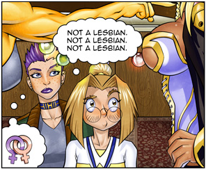
The suggestion shows an unwanted attraction, rather than just disgust like the current picture.
edited 11th Aug '12 5:48:39 PM by AnotherDuck
Check out my fanfiction! Hi
Hi
Whether or not the person having the moment is disgusted by it isn't important, at least according to the description. The main problem with the Simpsons pic is that it relies on the caption to get the trope across; take it away and anything could be happening in that scene, especially if you're not familiar with the show (like me). The Grrl Power pics don't need a caption to convey the trope.
My preference is the 2-panel pic. For this trope's purposes, the 3-panel is overkill. The 1-panel just doesn't get enough across...a perky rack doth not a bombshell necessarily make.
![]() Noted, and apologies if I misread.
Noted, and apologies if I misread.
edited 11th Aug '12 5:39:07 PM by Willbyr

Pretty sure the duck meant the suggestion is better. (Shows both those things, not just one of them.)
I like the one-panel; the other stuff seems beside the point.
Becky: Who are you? The Mysterious Stranger: An angel. Huck: What's your name? The Mysterious Stranger: Satan.
I like the one panel better. Less to read, and it's pretty obvious what the girl in the middle is staring at. I'd even suggest cropping the pic a little more to remove the two speech bubbles at the top, I don't really think they do anything to the pic except add empty space. The boobs and "not a lesbian" show the trope sufficiently.
edited 11th Aug '12 5:38:37 PM by nitrokitty
Hi
The speech bubbles at the top don't bug me.
^^ suggestion
edited 11th Aug '12 5:48:09 PM by rodneyAnonymous
Becky: Who are you? The Mysterious Stranger: An angel. Huck: What's your name? The Mysterious Stranger: Satan.
![]()
![]() Whether they bug you or not, do they really add anything? I say no. My ideal would be taking the same panel from the 3 panel version and blowing it up to full size. I think that would look best.
Whether they bug you or not, do they really add anything? I say no. My ideal would be taking the same panel from the 3 panel version and blowing it up to full size. I think that would look best.
![]() Edit: Rodney beat me to it. I think that looks much better.
Edit: Rodney beat me to it. I think that looks much better.
edited 11th Aug '12 5:47:56 PM by nitrokitty
No, the other one.
What rodney said is what I meant. I think the one-panel version is enough, cropped.
Check out my fanfiction!
Caption suggestion: "It's okay, we understand."
Hi
![]() I like that. So, what everyone's wanting is:
I like that. So, what everyone's wanting is:
edited 11th Aug '12 8:18:00 PM by Willbyr
Hi
A bit off-topic: It's amusing that the shot of the woman from the front just gives her awesome decolletage, but from the side, her nipples should be exposed...bit of an art failure. ![]()
edited 11th Aug '12 8:20:04 PM by Willbyr
 Evil-Smiting Umbrella
Further suggestion: if this is approved, make an image links page and move the former page image there.
Neither goony beard-men nor rainbow-haired she-twinks will stand in the way of my dreams! serial tweaker, sorry
7 (/11) is good.
please don't capitalize my handle. I just don't like it.
No, the other one.
![]()
![]()
![]() I noticed that too... Swirly patterns from different angles are hard to draw.
I noticed that too... Swirly patterns from different angles are hard to draw.
Hi
A couple more votes for 7/11 and we can run with it.

7/11 is ok.

Love 7/11. Looks fantastic.
Momentum, a function of mass and velocity, is conserved between portals. In layman's terms: speedy thing goes in, speedy thing comes out.
Throwing my support behind 7/11.
I still don't like that image. <_<
However, I'm not here to posit my dissatisfaction, I'm more here to snicker at how many times we said 7/11. ![]()
Added my support as well, and it's up, potholed and tagged. Anyone willing to make Image Links can do so.
"For a successful technology, reality must take precedence over public relations, for Nature cannot be fooled." - Richard Feynman
Hi
The old pic's added to the IL page; locking up.
In the Even the Girls Want Her thread ([1] ) it was suggested that this Grrl Power image might fit better on SSF than what's there.
Current:
Suggestion:
edited 11th Aug '12 3:33:53 PM by rodneyAnonymous
Becky: Who are you? The Mysterious Stranger: An angel. Huck: What's your name? The Mysterious Stranger: Satan.