 Hi
Hi
I'm good to revert it as well, or use one of the book cover arts.

EDIT: sized all images to 350px wide, and cropped 2nd image to cut out the "adapted for young adults" blurb.
Here are some covers of editions of the book, which could also be options:
3.1: EDIT: Has a spelling mistake ("autor") on the cover

3.2:
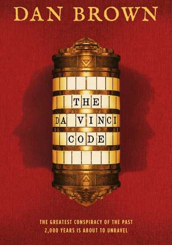
3.3:

3.4:
And the cover of the DVD, which, in contrast to the current film poster image, displays both the Mona Lisa image and the film actors:

edited 7th Aug '17 9:50:15 AM by LB7979
 How sweet it is
Either 3.3 or 3.4 will be good for me. 3.1 is fine as well.
edited 4th Aug '17 12:35:59 PM by Berrenta
she/her | TRS needs your help! | Contributor of Trope Report
Hi
3.3 is the version I was thinking of, but 3.2 is pretty cool as well.
3.2
I would have expected the page to have a soft split between tropes in the original work versus the film adaptation.
edited 4th Aug '17 7:18:43 PM by eroock
 Zzzzzzzzzz
Given that the page is currently about both the book and the film, I think 3.4 is the most illustrative. If/when it's split into Literature and Film namespaced pages, then we can change to an image from the appropriate work on both of those pages.
![]() As far as that goes, pages are't usually split like that unless there's a big difference between the original and the adaptation. If most of the tropes used are used in both, then if you wanted to,you could soft-split into "Tropes seen in both", "Tropes in the Book but not the Film" and "Tropes found in the Film but not the Book"
As far as that goes, pages are't usually split like that unless there's a big difference between the original and the adaptation. If most of the tropes used are used in both, then if you wanted to,you could soft-split into "Tropes seen in both", "Tropes in the Book but not the Film" and "Tropes found in the Film but not the Book"
edited 4th Aug '17 7:38:35 PM by Madrugada
...if you don’t love you’re dead, and if you do, they’ll kill you for it. 🍊orange fursona🧡
- 3.3 for me, likely personal preference, and because that's the first and one of the most recognizable covers.
- 3.2 is okay, but it kinda looks like a Steampunky YA novel.
- Also, 3.4 has the DVD watermark (which is not important), and somebody's gonna think that Tom Hanks wrote the book.
- 3.1 has a typo (Autor instead of Author).
PS: Tom Hanks on he current page image almost looks like Nicolas Cage when you see it at the forehead.
edited 15th Aug '17 10:51:49 PM by alnair20aug93
ᜇᜎᜈ᜔ᜇᜈ᜔|I DO COMMISSIONS|ᜇᜎᜈ᜔ᜇᜈ᜔
Huh, I didn't notice the typo in 3.1. I guess I'll change my vote to 3.2.
 Filthy casual
I'll go with 3.3.
(Annoyed grunt)
Is the "DVD" symbol in the lower right of 3.4, indicating that it's the DVD cover, really a problem? The "In theaters 05.19.06 / May 2006" of the current and previous posters (as well as images on many other Film pages) also give away they are movie posters, and that's never a problem.
And yikes, I overlooked the spelling mistake on 3.1; guess that one is not an option anymore.
🍊orange fursona🧡
Have we reached the verdict?
edited 12th Aug '17 11:23:24 AM by alnair20aug93
ᜇᜎᜈ᜔ᜇᜈ᜔|I DO COMMISSIONS|ᜇᜎᜈ᜔ᜇᜈ᜔
🍊orange fursona🧡
Bump.
ᜇᜎᜈ᜔ᜇᜈ᜔|I DO COMMISSIONS|ᜇᜎᜈ᜔ᜇᜈ᜔
Crowner?
Hi
Crowner's hooked. I didn't include 3.1 because of the spelling error.
🍊orange fursona🧡
Bump again. Also, can we address the one (The12th Doctor) who changed the page image w/o discussion? I messaged them once, but with the premade message syntax thingy that I can't add more to elaborate, there was no response.
edited 22nd Aug '17 4:34:50 AM by alnair20aug93
ᜇᜎᜈ᜔ᜇᜈ᜔|I DO COMMISSIONS|ᜇᜎᜈ᜔ᜇᜈ᜔
Hi
This one's just past a week old and there's a clear winner, so I'm going ahead and calling it. The new pic's up and tagged. locking up.
Old pic:
 |
Crown Description:
Nominations for replacement images:
The Da Vinci Code had this ◊ image but it was Cw/oD.
Previously: film poster with the Mona Lisa. Now: film poster with the two lead actors of the movie.
Note that this page is for both the book and the movie, as there are no different pages for each.
I vote for a revert to the Mona Lisa poster as that is more applicable to both the movie and book as opposed to the new poster.
This has also already been brought up by someone else in ATT .
.