
![]()
![]()
![]()
![]() I can hardly see the facial expressions, let alone gt any idea of context from them. Even if Kovu (I assume that's the darker lion in question) does look displeased, how do I know what he's displeased over and why?
I can hardly see the facial expressions, let alone gt any idea of context from them. Even if Kovu (I assume that's the darker lion in question) does look displeased, how do I know what he's displeased over and why?

It's not even Kovu. It might be his sister, or one of their lionesses. Either way, I don't see any evidence of standards in the picture. It's just Zira sneering.
... I already said it was just a suggestion. o.o
In any case, as I said earlier, it really depends on what KIND of image we're going for. If serious, the 9/11 Spider Man comic might be a good option. If silly, the "no, Thog, I'm still civilized" one would probably be better.
Of course, this isn't to say I'm opposed to some kind of middle ground either. o.o
edited 29th Dec '10 12:12:54 PM by neoYTPism
 Crazed Lawrencian
Might I suggest putting that old picture of villains talking about standards back?
edited 29th Dec '10 1:31:59 PM by Colonial1.1
Proud member of the IAA What's the point of being grown up if you can't act childish?
... which picture are you referring to? @ Colonial
 Hi
Hi
Right now, the OOtS pic is looking like the best option.
 Teutonic Tomboy T-Girl
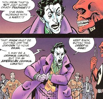
Taking a stab at making the Joker/Skull image work:

The Red Skull's dialogue is cut off, but I think it works OK, as his response isn't necessary to understand Joker's reaction.
The only question in my mind is whether the dialogue is legible. Looks OK to me (remember, it's shrunk a bit on the forum), if not ideal, but others might find it tougher on the eyes.
(I swear, though, the first person who screams "Wall of Text! Wall of Text!", I'm gonna hit something.)
edited 10th Feb '11 7:36:26 PM by suedenim
Jet-a-Reeno!
Hi
![]() It's good enough to consider; I can read it at its normal size.
It's good enough to consider; I can read it at its normal size.
edited 10th Feb '11 8:12:59 PM by Willbyr
 Mr. Dr.
I'd like it if the image was a little high resolution. Kinda have to squint to see the text on the top panel.
edited 10th Feb '11 8:16:16 PM by Mattonymy
You are displaying abnormally high compulsions to over-analyze works of fiction and media. Diagnosis: TV Tropes Addiction.
Teutonic Tomboy T-Girl
Hmm, if a higher-resolution scan would help, I may be able to oblige. Let me see what I can do here....
It does seem to make a difference. How's this?

edited 10th Feb '11 9:03:24 PM by suedenim
Jet-a-Reeno!
![]() Looks nice and readable to me.
Looks nice and readable to me.
 I see the Awesomeness.
Actually, you could probably just crop the bottom right of the panel with just "Keep back boys! This creep is mine!"
Fight smart, not fair.I like it better with the "...but I'm an American criminal lunatic!" line in there. Wouldn't want to cut that out.
edited 10th Feb '11 10:01:22 PM by troacctid
Rhymes with "Protracted."
If you cropped off some of the dead space on the right showing just Red Skull, you could probably make the resolution much bigger.
Do you have the comic page at full size? Let me take a crack at it.
Teutonic Tomboy T-Girl
Don't you kinda need the Red Skull to make the image work? I guess you'd still have the Joker talking about not working for Nazis, but I think they payoff's a lot better when you've got the guy with the crimson cranium wearing the swastika and SS symbol right there.
In any case, a full-size scan is here![]() ◊ if you want to mess around with it. (Note that I had to rescan it, because I'd stupidly overwritten the original, so there might be some minor differences, but it looks pretty much the same to me.)
◊ if you want to mess around with it. (Note that I had to rescan it, because I'd stupidly overwritten the original, so there might be some minor differences, but it looks pretty much the same to me.)
I really don't see how that's better, given it's still text-based to a ridiculous extent.

I like it. We can see the Joker's reaction to realizing he's working with a Nazi. He's surprised, then pissed off.
Infinite Tree: an experimental story
Here's two different crops.

Teutonic Tomboy T-Girl
Ah, OK, now I see what you were getting at.
Not bad, but if people think the original is sufficiently legible, I'd prefer to stick with that, just to have a better look at the Skull.
I'd prefer "The Pope #1" over "The Pope #2", as I think it's kind of important to get the swastika (and, to a lesser degree, the SS symbol) in there. Not only because people might not know the Red Skull as a character, but because he's just so overt about it.
Jet-a-Reeno! Cure Candy
I agree Pope #1 works the best.
Sparkling and glittering! Jan-Ken-Pon!
Mr. Dr.
The Pope's first cut is great.
edited 11th Feb '11 11:45:52 AM by Mattonymy
You are displaying abnormally high compulsions to over-analyze works of fiction and media. Diagnosis: TV Tropes Addiction.
Hi

Funny how we took down the previous image on this page for demonstrating everything to do with the trope completely in text only to see everyone lean towards another option that's even more heavy on the text than what we've already taken down.
I will say though that Joker's dialogue would make for a better page quote than the one already on the page.
Cure Candy
![]() IMO the fact that Red Skull is wearing a big fat Swastika adds a hell of alot to the the text far more than just a quote.
IMO the fact that Red Skull is wearing a big fat Swastika adds a hell of alot to the the text far more than just a quote.
edited 11th Feb '11 1:38:00 PM by Raso
Sparkling and glittering! Jan-Ken-Pon!
^The Swastika isn't even entirely in view so it's not easy to immediately recognize it. Most people would probably just pick up on everything that has to do with this trope from the speech bubble, including the word "Nazi."
As Ghilz said when he first shared the image with us in this topic, "Terrible image but great page quote."
edited 11th Feb '11 1:42:46 PM by SeanMurrayI
Crown Description:
Nominations for replacement images: