 Hi
Hi
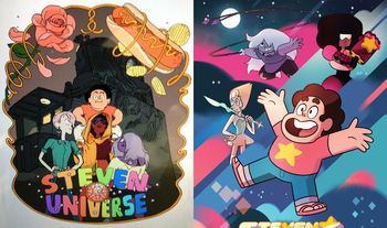
Either's good with me; for people unfamiliar with the show, the contrast between the concept characters and their actual designs is more clear.
 Filthy casual
With that in mind, I'll go with 1.2.
(Annoyed grunt) Goku Black
![]()

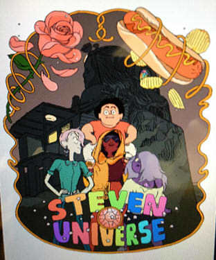
The details of the original concept art are less visible in the resized version...can we get a closer crop?

Some part of me wonders whether it might be better to omit the current designs, in favor of using a larger version of this concept art. It seems very unlikely that someone would end up on this page, not knowing what the main characters looked like. Either way, here's the concept art as a closer/straightened crop.
 The Unknown
The image quality for ![]() is terrible.
is terrible.
 he/him | Image Pickin' regular
Here's![]() ◊ a better quality version of
◊ a better quality version of ![]()
![]() .
.
Hi
Cropped a bit and resized:


It's okay to bump these, right?
Jawbreakers on sale for 99¢
Hi
![]() Yes, bumping is permitted as long as it's not excessive.
Yes, bumping is permitted as long as it's not excessive.
To be honest, I think it would be better to go with the first poster on its own.
Jawbreakers on sale for 99¢
he/him | Image Pickin' regular
![]() 8; most people on this page know what the characters look like.
8; most people on this page know what the characters look like.
Edited by rjd1922 on Dec 5th 2018 at 2:58:24 PM
Keet cleanup Hi
Hi
Clock is set.
9 works.
Hi
9 works well enough.
Goku Black
![]() 9
9
Filthy casual
9.
(Annoyed grunt)
Hi
The clock is way past due and I believe 9 has enough consensus, so it's in and tagged. Locking up.
Old pic:

While the current image is of an old (and terrifying) concept, I think something showcasing the first designs of the Crystal Gems would be a better fit for a What Could Have Been page.
Edited by Crossover-Enthusiast on Nov 23rd 2018 at 1:31:01 PM
Jawbreakers on sale for 99¢